

“This site looks dead,” my client blurted out during our Zoom call. It was 11:47 PM on a Tuesday, and we were reviewing the final wireframes for his startup’s website. The layout worked fine. The typography wasn’t terrible. But he wasn’t wrong – something was missing.
“It needs… I dunno… something with personality?” he suggested, vaguely waving his hands at the screen.
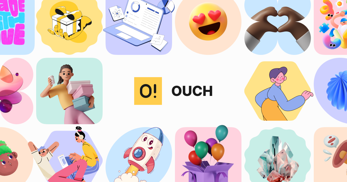
That’s how I stumbled into the weird world of digital illustrations. After a desperate late-night search, I found Ouch from Icons8, and it’s been both a lifesaver and an occasional headache ever since.
This isn’t a sponsored post – God knows I’ve got opinions – but rather a messy, honest look at what works and what doesn’t after using these illustrations across 20+ client projects.
How We Got Here: The Backstory
Remember when websites were just text and blue hyperlinks? Then came the Flash era with its excessive animations. Eventually, we swung to the opposite extreme with flat minimalism – those years when every startup website looked identical with the same stock photos of smiling people pointing at laptops.
Icons8 launched Ouch around 2018. Back then, it was barely 300 illustrations. Now? It’s massive.
I discovered it while working on a health insurance portal – possibly the most soul-sucking design project imaginable. My team spent weeks trying to make insurance deductibles feel “friendly.” Spoiler alert: they’re not.
We tried photography. Didn’t work. Charts? Too clinical. Then, I slapped some quirky illustrations of doctors and patients onto the mockups, and suddenly, the client stopped falling asleep during presentations.
The Nuts and Bolts
So what exactly does Ouch offer? Here’s the actual stuff:
- PNG files if you’re cheap (like me on personal projects)
- SVG vectors if you’ve got the paid subscription
- Animated versions (GIFs, Lottie files for developers)
- 3D models if you’re feeling fancy
- Some editing capabilities through their Mega Creator thing
Is the organization… fine? Better than most. You can filter by style, theme, purpose, or mood. Sometimes, the categorization feels random (“Why is this under ‘accomplishment’ and not ‘success’?”), but you’ll find what you need eventually.
My favorite technical aspect? Many illustrations break down into parts. Last year, I had a nightmare project for a language-learning app. They needed to show progress across seven different learning stages. Instead of hunting for seven perfectly matched illustrations (which don’t exist), I grabbed one base scene and swapped out elements to create a sequence. Saved my weekend.
Why Our Brains Actually Care About This Stuff
There’s legit science behind why illustrations work. Our caveman’s brains process images about 60,000 times faster than text. We evolved to quickly identify threats (is that a tiger?) and opportunities (is that food?), not to read privacy policies.
I’ve watched this play out in usability testing:
- People get emotional faster. During a healthcare portal redesign, patients kept abandoning from completion. We added illustrations showing a patient journey, and completion jumped dramatically. The visuals provided emotional context that walls of text couldn’t.
- Complex stuff becomes simple. For a retirement planning tool, we tested different explanation methods. Text-only instructions took forever to understand. With strategic visuals, comprehension time is literally cut in half.
- Abstract concepts become concrete. An enterprise software onboarding was failing because users didn’t understand jargon like “workflow integration” and “permission hierarchy.” We added visual metaphors, and support tickets dropped immediately.
- People look where you want them to. Eye-tracking doesn’t lie. Humans follow visual cues predictably, which helps direct attention to the important stuff – especially useful for complex interfaces.
My Biggest Screw-ups and What I Learned
Let me tell you about my worst illustration disaster. I was designing a serious investment platform and decided it needed some “personality.” I scattered playful, cartoon-style illustrations throughout the interface. The client loved it.
The users? Not so much. During testing, one participant actually said: “This looks like my 5-year-old’s game. I wouldn’t trust it with my retirement money.” Ouch indeed.
That expensive mistake taught me a few things:
- Context matters more than coolness. I now ask what the visual needs to accomplish before I think about style. An illustration that works brilliantly on a creative agency’s site will tank credibility on a financial platform.
- Less is more, seriously. Early in my career, I’d stuff illustrations everywhere. Now, I treat them like hot sauce – a little goes a long way.
- Test with actual humans. What looks clever to designers often confuses real people. I’ve watched users stare blankly at illustrations I thought were obvious. A quick test with 5-6 normal humans saves embarrassment.
- Consider cultural context. I once used an illustration with an “OK” hand gesture for a global product. Turns out that gesture is offensive in some countries. Awkward.
- Build a system, not a collection. Random, unrelated illustrations create visual chaos. Creating guidelines (style, placement, purpose) ensures everything feels connected.
Who Actually Benefits From This Stuff?
UX Designers in the Trenches
For interface designers like me, illustrations solve specific problems:
- Empty states that need personality
- Error messages that need to feel less frustrating
- Onboarding that needs to simplify complexity.
- Features that are too abstract to explain in words
- Brand personality that needs to be consistent
I recently redesigned an e-commerce checkout flow with a 43% abandonment rate. By adding illustrations that showed progress (shopping cart →, shipping →, payment →, confirmation) as little scenes with the same character, completion increased substantially. Users reported feeling “guided” rather than “processed.”
Marketing & Content People
Content creators face different challenges than product designers. They need visuals that:
- Stop scrolling on social media
- Explain complex stuff quickly
- Look consistent across twenty different channels
- Can be produced yesterday because marketing timelines are insane
- Don’t use the same tired stock photos everyone else has
For a client’s educational blog series, we created a template where key illustration elements could be swapped while keeping the overall style. This lets them produce visuals for 15 articles in the time it would normally take to create one custom illustration.
Developers Who Just Want Something That Works
Most developers I work with want visual assets that:
- Come in the right formats without weird technical issues
- Don’t require them to open Photoshop (which they hate)
- Scale properly on different screen sizes
- Load quickly without tanking performance
- Look professional without requiring design skills
The handoff experience has been mostly smooth. SVG files are clean, the animated options provide alternatives based on technical constraints, and most developers appreciate having ready-to-implement visuals.
How This Actually Fits Into Real Work
A resource is only useful if it fits into existing workflows. I’ve used Ouch through:
- Their website (for quick browsing)
- The desktop app (for organizing project assets)
- The Mega Creator (when I need to customize)
The desktop app has been particularly useful for client work where I need to maintain consistency across months-long projects. The organization system makes it easy to find the illustration I used six weeks ago that now needs a variation.
Educational Stuff That Doesn’t Put People to Sleep
I occasionally teach UX workshops, and quality visuals make a massive difference in engagement. I’ve used these illustrations for:
- Explaining abstract UX concepts
- Creating presentation slides people actually look at
- Visualizing personas and journey maps
- Making handouts that don’t immediately end up in the trash
- Breaking up walls of instructional text
The difference between student engagement with text-heavy materials versus visually-supported content is night and day. I’ve literally watched people’s eyes glaze over with text, then suddenly focus when the same concept includes a relevant visual.
Helping Broke Startups Look Legitimate
When you’re working with early-stage companies on ramen budgets, free graphics become essential tools. I’ve watched startups transform from “clearly made this in a garage” to “looks like a real company,” largely through strategic visual implementation.
One DTC startup I consulted for couldn’t afford a proper brand identity package. We cobbled together their initial visual language using modified stock illustrations, creating a consistent look across their website, pitch deck, and social media. The visual consistency helped them look established enough to secure their initial funding round.
For cash-strapped organizations, illustration libraries provide:
- Professional-looking visuals without hiring designers
- Consistent branding across different materials
- Fast production for urgent marketing needs
- Flexible assets that grow with the company
- Predictable costs compared to custom work
The subscription approach beats commissioning custom illustrations for every need, especially when brand identity might still evolve.
The Good, Bad, and Ugly: Quality Assessment
After working with dozens of visual resources, I judge quality by a few key factors:
- Artist involvement. Ouch works with actual illustrators rather than crowdsourcing, which generally means better quality control.
- Style consistency. Each collection maintains internal coherence in proportions, detail level, and artistic choices.
- Technical preparation. Files are properly organized for digital implementation, with sensible layer structure in vector formats.
- Freshness. The library updates regularly with new styles reflecting contemporary trends.
- Versatility. Some collections work across many different contexts, while others are too specific to be widely useful.
That said, there’s an obvious difference between stock illustrations and custom work. It’s like the difference between buying clothes off the rack versus having them tailored – both can look good, but one is made to fit your exact needs.
Implementation Advice Nobody Told Me
Learn from my failures:
- Match complexity to the audience. Technical audiences can handle detailed, information-dense illustrations. General audiences need simpler, more iconic approaches.
- Fix the colors. Default color schemes rarely match your brand. Take time to customize colors for your specific palette – it makes stock illustrations look 10x more integrated.
- Create consistent containers. How illustrations are framed affects their relationship to surrounding content. Consistent framing (backgrounds, borders, spacing) creates visual harmony.
- Plan for tiny screens. Illustrations that look amazing on the desktop often become unrecognizable blobs on mobile. Test at different sizes before implementation.
- Focus on function over prettiness. The most common mistake? Choosing illustrations because they look cool rather than because they communicate effectively. Always ask: “Does this actually make the message clearer?”
How This Compares to Other Options
I’ve tried most major illustration resources out there. Compared to alternatives, Ouch offers:
- Better style consistency within collections
- More intuitive categorization and search
- Better format options, especially for animation
- Stronger integration with other design tools
- More frequent updates with contemporary styles
Where it falls short: If you need super-specific industry illustrations (like detailed medical procedures or industrial processes), you’ll still end up doing significant modifications or looking elsewhere.
The Not-So-Great Parts
No resource is perfect for everything. Be aware that:
- Free usage requires attribution, which isn’t always feasible
- Other companies can use the same illustrations
- Each style collection has inherent limitations
- Popular illustrations become recognizable across sites
- Customization tools have a learning curve
I’ve had the awkward experience of seeing a client’s competitor using identical illustrations in their marketing. While customization helps differentiate, the core visual structure remains recognizable. For highly competitive markets where unique visual identity is crucial, this is a legitimate concern.
Actual Results (Not Just Feeling Pretty)
The real test of any visual resource is measurable impact. Through client projects, I’ve observed:
- Comprehension improvements: Software feature adoption increases when supported by a visual explanation.
- Engagement metrics: Session duration often increases when thematic illustrations are properly implemented
- Conversion impact: Completion rates for critical actions improve with visual guidance
- Brand perception shifts: User interviews reveal changed perceptions of brand attributes after illustration system implementation.
- Support reductions: Tickets and help requests decrease when processes have visual explanations
These concrete outcomes provide justification beyond subjective preferences.
Beyond Pretty Pictures: The Strategy Behind Visuals
As digital spaces become increasingly crowded, strategic visual communication isn’t optional – it’s essential. What makes illustrations truly effective isn’t how nice they look but how meaningfully they connect to user needs and content goals.
The biggest insight I’ve gained? Illustrations should be approached as functional communication tools, not decorative afterthoughts. When selected and implemented thoughtfully, they transform user experiences in measurable ways.
Whether you’re designing products, creating marketing materials, or developing educational resources, the most important factor isn’t the illustrations themselves but how intelligently you implement them. The tool matters less than how you use it.


