


Introduction
In the beginning of web design, pages were created for a specific screen size. If the user had a larger or a smaller screen, it resulted in:
- unwanted scrollbars,
- poor use of space,
- overly extended strings.
The concept of responsive web design (RWD) appeared when multiple screen sizes became available. The whole idea of design has changed. And the idea on how we can provide web design for multiple different devices.
Hereby you will find RWD basic techniques and how to master them.
What Is Responsive Web Design
What is responsiveness? It is the ability to adjust to certain technical conditions. In case o a web-site, this would refer to the user screen. A responsive site looks the same on:
- a desktop
- a laptop,
- a tablet,
- a smartphone.
Neither screen measurements (e.g. 5”), nor positioning affects the responsive page.
Responsive web-page adjusts to the device screen and orientation. Even more should the user rotate the screen, the responsive page stays the same.
Responsive Web Design aim is user-friendliness. Plus, it ensures that conversion rate is not device-dependent.
The evolution of Responsive Design
Before RWD, you had two options when designing a website:
- Create a fluid site that stretches to fit the browser window;
- Create a site with fixed width (i.e fixed size in pixels).
As a result, this website design looked OK on one screen size only. Rather, on the developer’s screen. Smaller screens made a fluid site look squashed. Larger screens in turn displayed unreadable long lines. Fixed width site looked no better. Smaller screens had user-unfriendly horizontal scroll bars. Larger screens in turn displayed a lot of white space at the edges.
First smartphones made mobile web more accessible. Some companies started looking into the emerging mobile market. To do so they created mostly ad-hoc mobile versions of their sites. With a different URL for mobile version. To keep up, they needed to:
- develop,
- maintain,
- and keep two separate versions of the site up to date.
Mobile websites look stripped when compared to the desktop ones. Within a period of time, mobile gadgets grew in terms of power and features. Now they could display entire websites. However, mobile users were annoyed. They were able to access only the mobile version of the site. The fully functional website version was unavailable for them. To address this issue the RWD is applied.
Why You Need Responsive Web Design
The mobile traffic amount grows daily. Around 50+% of mobile traffic comes from smartphones and tablets. These figures are subject to grow. Mobile technologies let everyone surf the internet from everywhere:
- When you lie on a sofa,
- When you walk down the street,
- When you use public transport to name.
Mobile audience grows constantly. This can’t be ignored. Business is the reason to adapt websites for portable devices.
Responsive Web Design was considered unnecessary. But that was valid when the mobile traffic share was relatively small. These days are history. If you need mobile traffic you have to adapt. Any web studio utters RWD as a key point in their client brief. Plus they do so at the very beginning of communicating with the client.
Responsive Web Design and Website Mobile Version – differences
A website with a mobile version is not a site with a responsive web design. And vice versa.
Currently, Responsive web design is an integral part of the site itself. That means that regardless of the device, the source remains intact. An RWD site consists of several types of design elements and can therefore be more complex to implement. Site administration, however, becomes easier. Should you need to e.g. change the prices in an online store you do so in one admin panel. But the corrected price is correctly displayed on all devices.
The website mobile version is, in fact, a separate site. It is created specifically for mobile devices. And optimized so. Such website administration, however, is much more complicated. Bear in mind that you need to make changes to two sites instead of one. That requires additional resources.
Differences in RWD and mobile site development
Normally a responsive site development is more expensive than a regular non-adaptive one. The higher price comes from greater complexity of development.
- Responsive web design requires you to create several layout options for different screen sizes. Each screen version requires additional engineering. Web-developers spend more time creating such sites. Both the terms and the development cost increase.
- Responsive web design is more difficult. Implementing it takes more effort. There are several ways to do so. It is up to developer to choose the most suitable one.
- The QA volume also increases. One must thoroughly test the project before deployment.Responsive website requires separate testing on any screen (desktop, smartphone, and tablet).
Responsive App Design Techniques and Templates
Responsive web design techniques evolve rapidly. Yet, many proven options work well.
Most of the responsive web page layouts fall into one of five template categories:
- Mostly Fluid,
- Column Drop,
- Layout Shifter
- Tiny Tweaks,
- Off Canvas.
Some pages may use a template combination (e.g. Column Drop and Off Canvas). These templates are a solid starting point for any responsive page. Both templates were originally defined by Luke Wroblewski,
Mostly Fluid
The Mostly Fluid template consists of a rubber grid. It remains the same on large or medium-sized screens. While on large screens the margins are adjusted.
The fluid grid rearranges the main content on small screens. The columns are stacked one below the other. This template main pro is that it only needs one breakpoint between small screens and large screens.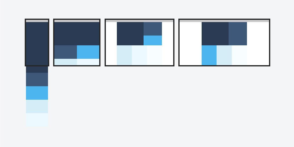
Column Drop
Column Drop is a template with multiple columns that span the entire screen width. It simply places columns vertically one-by-one. This works if the window becomes too small to display all content.
Over time, all the columns will be located vertically, one below the other. The choice of breakpoints for this layout template depends on the content. You should determine it separately for each design option.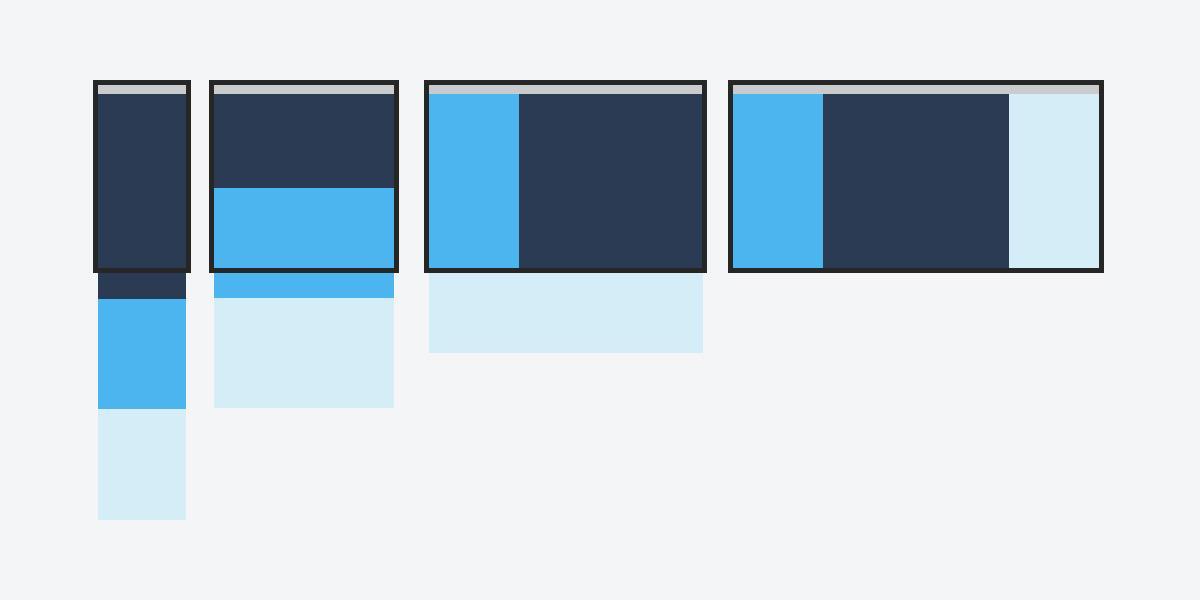
Layout Shifter
The Layout Shifter template is the most responsive as it provides multiple breakpoints for different screen widths.
The Layout Shifter major difference is that content is constantly relocated. The website doesn’t recalculate the render tree and place columns under one another. Due to the significant differences between the major breakpoints, maintaining this layout is more challenging. You may need to change not only the overall layout but also its individual elements.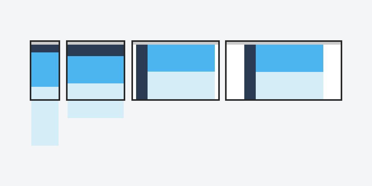
Tiny Tweaks
The Tiny Tweaks template simply makes small changes to the layout;
- adjusts the font size,
- resizes the images,
- moves the content.
It works well on single-column layouts (i.e. one-page linear websites and articles with a lot of text).
As you can tell from the template name, minor modifications are made to this sample when the screen is resized. As screen width increases, font size and margins enlarge as well.
Off Canvas
Rather than stacking content items vertically on top of each other, the template places content that is rarely used, such as navigation or app menu items, off-screen. These bits are displayed only when the screen size allows. On smaller screens, said content can be accessed in one click.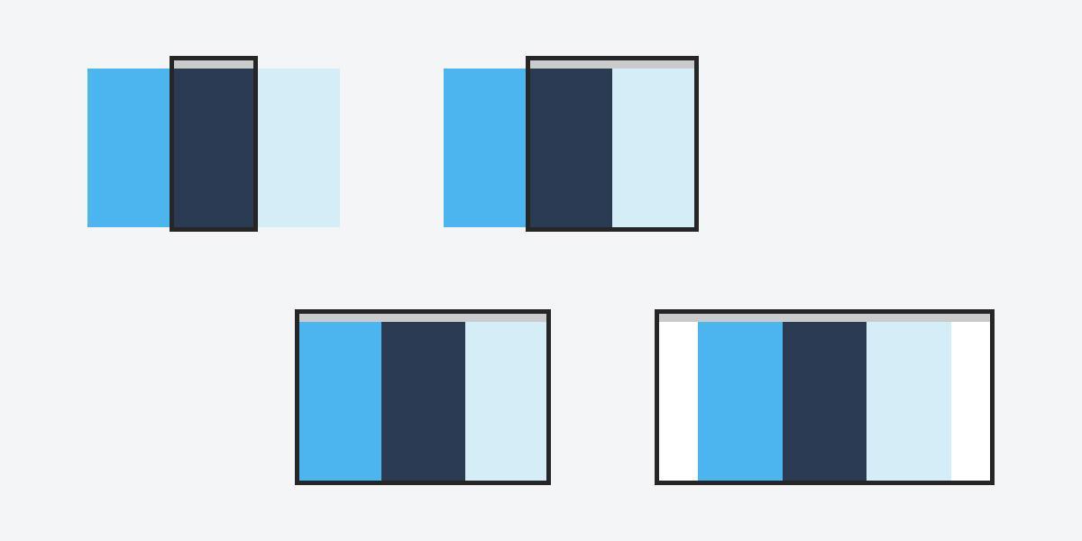
Conclusion
Design is rapidly evolving and adapting to customer needs. The more devices support your web application, the more work it requires. Even more so, in case of MVP Development. You need to be sure that everything is displayed correctly. Responsive web design boosts the work of developers and designers, as well as user experience and convenience. Implementing this technology is not easy. Your best bet is to entrust this work to a specialized company. For one, Bamboo Agile is a company with rich experience in responsive web design. Yet, you can still opt for independent web-site development of a site with a responsive web design is also possible, since there’s a huge number of various resources available on the internet.


