


Web design is a tricky subject. There are a lot of things you should consider when creating a website. In order to simplify this task, I’ve prepared a list of do’s and don’ts principles every web designer should take into account. And the good news is that they’re all simple principles.
Let’s get started!
Do
1. Provide a similar experience, regardless of the device
Visitors are coming to your site using many different types of devices: they can visit your site on their desktop or laptop, tablet, phone, music player or even their watches. A big part of UX design is ensuring that no matter how the visitor sees your site, they should have a similar experience regardless of the device they are using.

2. Design easy-to-use clear navigation
Navigation is a cornerstone of usability. Remember, it doesn’t matter how good your website is if users can’t find their way around it. That’s why navigation on your site should be:
- Simple (Every site should have the simplest structure possible)
- Clear (Navigation options must be self-evident for visitors)
- Consistent (Navigation system for the home page should be the same on every page)
Design your navigation in a way that gets visitors where they want to go with the least amount of clicks as possible while still being easy to scan and locate where they need to go.
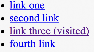
3. Changing the color of visited links
Links are a key factor in this navigation process. When visited links don’t change color, users can unintentionally revisit the same pages repeatedly.
Knowing your past and present locations makes it easier to decide where to go next.
4. Make it easy to scan your pages
When users visit your site they are more likely to quickly scan the screen than they are to read everything there. Therefore, if a visitor wants to find content or complete a task, they are going to scan until they find where they need to go. And you, as a designer, can help them with that by designing good visual hierarchy.
Visual hierarchy refers to the arrangement or presentation of elements in a way that implies importance (e.g. where they eyes should focus first, second, etc).
Make the important things such as screen titles, login forms, navigation items, or other important content a focal point so visitors see it right away.
5. Double check all links
A user can easily become frustrated when they click a link on the site and receive 404 error page in response. When visitors are searching for content, they expect every link to take them where it says it will and without a 404 error or to another place they weren’t expecting.

6. Ensure that clickable elements look like ones
How an object looks tells users how to use it. Visual elements that look like they are links or buttons, but aren’t clickable (i.e. underlined words that aren’t links, elements that have a call-to-action but are not hyperlinked) can easily confuse users. Users need to know which areas of the page are plain static content, and which areas are clickable (or tappable).
Make clickable elements obvious to users
Don’t
1. Make your visitors wait for content to load
The attention spans and patience of web users are very small. According to NNGroup research:
10 seconds is about the limit for keeping the user’s attention focused on a task
When visitors have to wait for your site to load, they will become frustrated and likely leave your site if it doesn’t load fast enough for them. Even the most beautifully designed loading indicator can force users to leave the site if the loading takes too long.

2. Don’t open link in a new tab
This rude behaviour disables the Back button which is the normal way users return to previous sites.
3. Let promotion steal the show
Promotions and ads can overshadow the content they’re next to and make it harder for users to accomplish tasks. Not to say that anything that looks like an advertisement is usually ignored by users (the phenomenon is known as banner blindness).
4. Hijack scrolling
Scroll hijacking is when designers/developers manipulate the scrollbar to behave differently on their website. This can include animated effects, fixed scroll points, and even a redesign of the scrollbar itself. Hijacked scrolling is one of the most annoying things for many users since it takes control away from them.
When you design a website or user interface, you want to let the user control their browsing and movement through the site or application.
5. Auto-play videos with sound
Auto-play videos, music or sounds in the background irritate users. These elements should be used sparingly and only when appropriate and expected.
6. Sacrifice usability for the sake of beauty
The design of a site or user interface should never interfere with the user’s ability to consume the content on the screen. It’s important to avoid having busy backgrounds behind content, poor color schemes that hinder the site’s readability or insufficient color contrast (such as in the example below).
7. Use blinking text and ads
Content that flashes or flickers can trigger seizures in susceptible individuals. Not only can it cause seizures, but it’s likely to be annoying or distracting for users in general.

(Disclaimer: This post was originally published in babich.biz by Nick Babich and has been reproduced with permission. Techstory is not responsible or liable for any content in this article.)
Image Source: weballdesign.gr


