• Send Us A Tip
  • Calling all Tech Writers
  • Advertise
Saturday, June 27, 2026
  • Login
TechStory
  • News
  • Crypto
  • Gadgets
  • Memes
  • Gaming
  • Cars
  • AI
  • Startups
  • Markets
  • How to
No Result
View All Result
  • News
  • Crypto
  • Gadgets
  • Memes
  • Gaming
  • Cars
  • AI
  • Startups
  • Markets
  • How to
No Result
View All Result
TechStory
No Result
View All Result
Home Design

History Of Googles Logo Changes And Thought Process Behind Their Creation !

by
April 9, 2016 - Updated On May 6, 2016
in Design, Tech
Reading Time: 3 mins read
0
History Of Googles Logo Changes And Thought Process Behind Their Creation !
TwitterWhatsappLinkedin

Recent launch of Google’s new logo on September 1, 2015 has been well received by the masses. It takes Google back to its’ roots, i.e. to its’ parent company Alphabet. The new logo bears resemblance to the Alphabet logotype. Product Sans has been the font used by Google since September 2015. During the launch, Larry Page, the company’s CEO, wrote in a blog post, “Google is not a conventional company. Our mission—to take the world’s information and make it universally accessible and useful—continues to evolve…. a new brand identity that aims to make Google more accessible and useful to our users—wherever they may encounter it.”

You might also like

Pax Silica Anthropic Claims Alibaba Defied Warnings to Attack Claude and Steal Capabilities

Scaling Silicon Google Deploys Billions to Commercialize Custom TPU Frameworks

BMW M Boss Signals Hope for a New M1 Supercar as Revival Dreams Gather Pace


Googles New Logo

Source

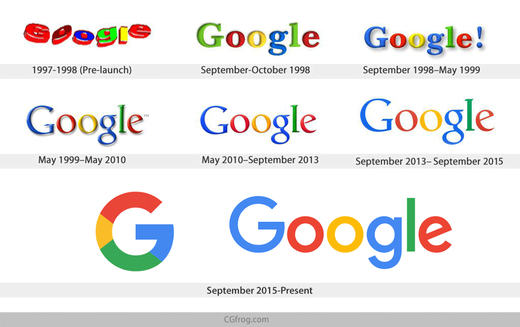
 Relating to Google’s new look, let’s take a look back at it’s various logo evolutions. In relatively short period of 17 years, Google’s new logo has experienced far more redesigns, overhauls, and tweaks. The most common thing in all these changes is the word ‘Google’. No matter what the logo is today, it has complete relativity to the it’s first logo. That is the special thing- creating new identities by holding onto the previous strong identities. None of the logo evolution was out of the way, creating an entirely new brand.

Google's new logoSource

The colors used by Google in all logos have been the same throughout. According to Ruth Kedar, the graphic designer who developed the now-famous logo, ““We ended up with the primary colors, but instead of having the pattern go in order, we put a secondary color on the L, which brought back the idea that Google doesn’t follow the rules.” So, it looks like they started with the primary colors (blue, red, yellow) and then added green to be a bit different.” The 2015 designs also marks a major departure history since Google also dropped it’s exclamation mark.

The Google logo has always had a simple, friendly, and approachable style. These qualities were retained by combining the mathematical purity of geometric forms with the childlike simplicity of schoolbook letter printing. the rotated ‘e’ of the previous mark is a reminder that Google will always be a bit unconventional. The final logotype was tested exhaustively at various sizes and weights for maximum legibility in all the new digital contexts.

The Google G is directly derived from the logotype ‘G,’ but uses increased visual weight to stand up at small sizes and contexts where it needs to share space with other elements. The color proportions convey the full spectrum of the logotype and are sequenced to aid eye movement around the letterform.

Now, the Google Dots in motion which are a dynamic and perpetually moving state of the logo. They represent Google’s intelligence at work and indicate when Google is working for you. A full range of expressions were developed including listening, thinking, replying, incomprehension, and confirmation. While their movements might seem spontaneous, their motion is rooted in consistent paths and timing, with the dots moving along geometric arcs and following a standard set of snappy easing curves.

According to Google Design, the challenges to be overcome while logo creation were ‘a scalable mark that could convey the feeling of the full logotype in constrained spaces, incorporation of dynamic, intelligent motion…., a systematic approach to branding… to provide consistency in people’s daily encounters with Google, a refinement of what makes… Googley.’

All in a nutshell, with slight changes here and there, Google still stands strong in providing knowledge to billions and sticking to its’ grounds and identities.

Tags: GoogleGoogle Logo DesignGoogle Logo HistoryLarry PageLogoSergey Brin
Tweet59SendShare17
Previous Post

10 Books That Entrepreneurs Must Have On Their Shelves!

Next Post

EquityZen Is Opening Up The Gold Mine Of Pre IPO Investments For Larger Investor Base !

Recommended For You

Pax Silica Anthropic Claims Alibaba Defied Warnings to Attack Claude and Steal Capabilities

by Anochie Esther
June 27, 2026
0
Anthropic's $965 billion valuation

The geopolitical cold war over artificial intelligence has officially escalated from chip supply bans into open industrial-scale data warfare. For the past year, the United States and China...

Read more

Scaling Silicon Google Deploys Billions to Commercialize Custom TPU Frameworks

by Anochie Esther
June 27, 2026
0
NVIDIA alternative

The intense global race for artificial intelligence dominance has officially shifted its primary focus from software model development to sheer physical infrastructure capacity. For nearly a decade, Google...

Read more

BMW M Boss Signals Hope for a New M1 Supercar as Revival Dreams Gather Pace

by Samir Gautam
June 27, 2026
0
BMW M Boss Signals Hope for a New M1 Supercar as Revival Dreams Gather Pace

For decades, the BMW M1 has occupied a special place in automotive history. It was bold, rare and unlike anything else BMW had built. Although production ended in...

Read more
Next Post
EquityZen Is Opening Up The Gold Mine Of Pre IPO Investments For Larger Investor Base !

EquityZen Is Opening Up The Gold Mine Of Pre IPO Investments For Larger Investor Base !

Please login to join discussion

Techstory

Tech and Business News from around the world. Follow along for latest in the world of Tech, AI, Crypto, EVs, Business Personalities and more.
reach us at info@techstory.in

Advertise With Us

Reach out at - info@techstory.in

Aviator Game India 2026

BROWSE BY TAG

#Crypto #howto 2024 acquisition AI amazon Apple Artificial Intelligence bitcoin Business China cryptocurrency e-commerce electric vehicles Elon Musk Ethereum facebook funding Gaming Google India Instagram Investment ios iPhone IPO Market Markets Meta Microsoft News OpenAI samsung Social Media SpaceX startup startups tech technology Tesla TikTok trend trending twitter US

© 2025 Techstory.in

No Result
View All Result
  • News
  • Crypto
  • Gadgets
  • Memes
  • Gaming
  • Cars
  • AI
  • Startups
  • Markets
  • How to

© 2025 Techstory.in

Welcome Back!

Login to your account below

Forgotten Password?

Retrieve your password

Please enter your username or email address to reset your password.

Log In
Are you sure want to unlock this post?
Unlock left : 0
Are you sure want to cancel subscription?