

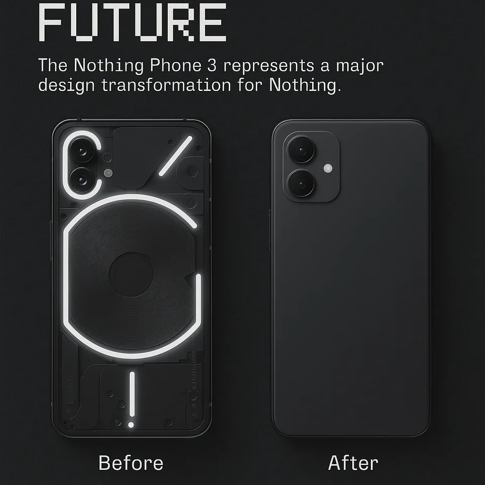
Nothing, the London-based tech brand known for its distinctive design language, has taken a daring leap with the Nothing Phone 3. Breaking away from the precedent set by its predecessors, the Phone 3 introduces a bold new design that forgoes the much-discussed Glyph Interface. This move signals a significant shift in the company’s approach to smartphone aesthetics and user experience, sparking widespread conversation among tech enthusiasts and industry watchers.
The Glyph Interface, a signature feature of the Nothing Phone 1 and Phone 2, used a series of LED strips on the back of the device to deliver notifications, charging status, and other interactive cues. Its unique visual appeal helped Nothing carve out a niche in a crowded smartphone market. However, with the Phone 3, Nothing has opted for a cleaner, more streamlined rear panel, prioritizing minimalism over the previous model’s visual flair.
Design Philosophy: Embracing Minimalism and Functionality:
The new design philosophy of the Nothing Phone 3 is rooted in simplicity and practicality. The rear panel is now free from the intricate LED patterns, resulting in a smooth, uninterrupted surface. This minimalist approach is complemented by the use of premium materials and refined finishes, lending the device a sophisticated and modern look.
According to sources, the decision to remove the Glyph Interface was driven by user feedback and a desire to focus on core smartphone functionality. Many users appreciated the Glyph’s novelty but expressed a preference for a more understated design that would blend seamlessly into both professional and casual settings. The Phone 3’s new look responds directly to this sentiment, offering a device that stands out through subtlety rather than spectacle.
The phone’s overall build quality has also seen improvements, with enhanced durability and a more ergonomic feel. The edges are slightly more rounded, making the device comfortable to hold for extended periods. The camera module has been redesigned for better integration with the rear panel, further contributing to the phone’s sleek profile.
Balancing Innovation and Practicality:
While the absence of the Glyph Interface marks a departure from Nothing’s earlier approach, the Phone 3 compensates with several user-centric enhancements. The device features a brighter and more vibrant display, offering improved visibility in various lighting conditions. The screen-to-body ratio has been optimized, resulting in slimmer bezels and a more immersive viewing experience.
Internally, the Phone 3 is powered by the latest hardware, ensuring smooth performance for multitasking, gaming, and media consumption. The company has also focused on software refinement, with Nothing OS receiving updates that enhance usability and customization options. Users can expect a cleaner interface, faster app launches, and improved battery management.
One of the key aspects of the Phone 3’s design is its emphasis on sustainability. Nothing has incorporated more recycled materials into the device’s construction, aligning with growing consumer demand for environmentally responsible products. Packaging has also been minimized, reducing waste and reinforcing the brand’s commitment to eco-friendly practices.
Market Response and the Future of Nothing’s Design Language:
The tech community’s response to the Nothing Phone 3’s introduction has been conflicting. While some fans are disappointed that the Glyph Interface is no longer available, others applaud the company’s readiness to change and try out new design approaches. This bold move, according to industry observers, may help Nothing appeal to a wider audience, especially those who prefer elegance and simplicity to extravagant features.
Retailers and early reviewers have highlighted the Phone 3’s refined aesthetics and improved ergonomics as standout qualities. The device is expected to compete strongly in the premium mid-range segment, where design differentiation plays a crucial role in consumer choice. By prioritizing minimalism and functionality, Nothing aims to position the Phone 3 as a versatile option for both tech enthusiasts and mainstream users.
The company’s design strategy will likely continue to evolve in response to market trends and user feedback. The decision to abandon the Glyph Interface for the Phone 3 does not necessarily signal the end of experimental features for Nothing. Instead, it reflects a willingness to adapt and innovate in pursuit of the optimal balance between form and function.
Conclusion:
For the brand, the Nothing Phone 3 marks a turning point as it moves from daring experimentation to elegant minimalism. Nothing is setting a new standard for smartphone aesthetics by abandoning the Glyph Interface and adopting a simpler, more elegant design. In a crowded market, the Phone 3’s combination of high-end components, ergonomic upgrades, and user-focused additions makes it an appealing option. Nothing’s most recent release, which the tech community is closely monitoring, shows the company’s dedication to innovation and willingness to rethink what makes a smartphone really unique.


