

Apple’s unveiling of iOS 26 at the Worldwide Developers Conference (WWDC) 2025 in Cupertino marked what it hoped would be a visual shift in its mobile operating system. But while the company celebrated the new design, reactions from users were far from enthusiastic. The most talked-about change in iOS 26 is the introduction of a visual overhaul Apple calls “Liquid Glass,” a translucent and layered user interface theme that Apple described as making the experience more expressive and pleasing. However, many iPhone users strongly disagree, raising widespread concerns regarding readability and usability.
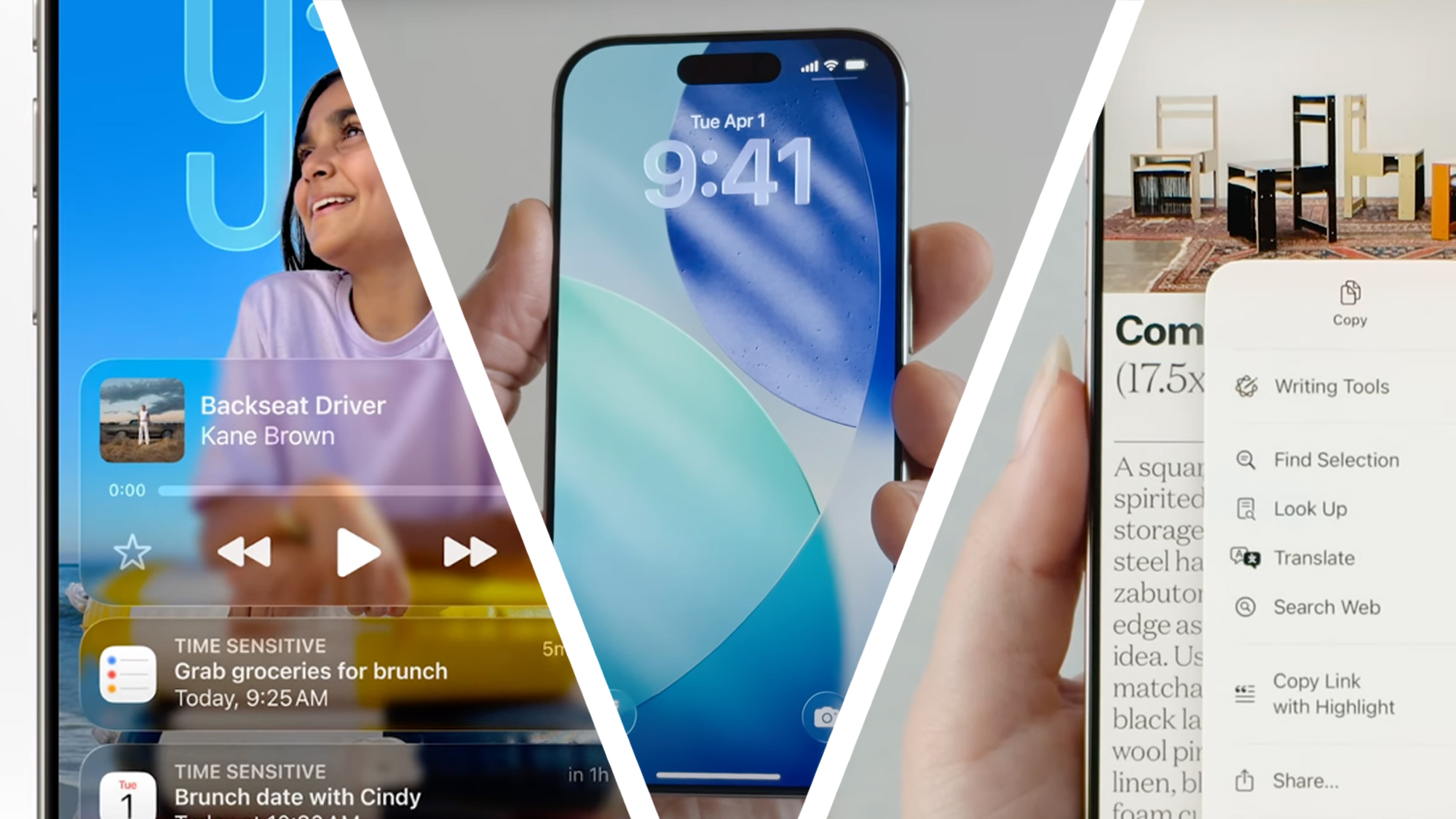
Apple’s senior vice president of Software Engineering, Craig Federighi, described the new Liquid Glass design as a “gorgeous” update that adds a fresh feel to iPhones and iPads. The interface features shimmering transparency, flowing visual layers, and interactive responses that subtly shift as users navigate through their devices. It appears heavily inspired by the interface of the Apple Vision Pro, carrying a glossy and fluid aesthetic that Apple hopes will define the look of its devices for years to come.
welcome back, windows vista pic.twitter.com/1vVdEwFeZL
— Val Pieŭnioŭ (@mamkindesigner) June 9, 2025
Despite this ambition, the new design has triggered a wave of criticism across online platforms. Users on Reddit, X (formerly Twitter), and other forums shared strong reactions, with many expressing that the translucent effects create more problems than benefits. In particular, users with visual impairments or age-related vision issues have found the changes concerning. A common complaint is that the high level of transparency often makes it difficult to distinguish foreground content from the background, especially when set against bright or patterned wallpaper.
One Reddit user summed up the concerns by asking for the “frosting” effect to be customizable, pointing out that when backgrounds are even mildly busy, the new design becomes a serious accessibility issue. Another user mentioned that while they appreciated Apple’s attempt at a new look, they found the actual experience overwhelming, calling it an “accessibility nightmare.” They added that for users with less-than-perfect eyesight, the Liquid Glass design could make using their devices far more difficult than before.
Literally nobody:
Apple: I feel like Vista today ??? pic.twitter.com/DedmJc6UUP
— Ilya · イリア (@ilyamiskov) June 9, 2025
Some of the most pointed criticism has come from those who have already installed the iOS 26 Developer Beta. These users noted that the operating system, as it currently stands, suffers from a lack of contrast in several key UI elements. Notifications, toggles, and quick-access menus were all highlighted as examples of places where text becomes hard to read. One user bluntly stated that the lock screen in particular looked “like hell” and made them squint just to read basic information.
Complaints are not limited to usability issues alone. Many have taken issue with the very idea of overhauling the visual identity in such a dramatic way. While Apple markets Liquid Glass as a bold new step, several users feel the change is poorly timed and lacks depth in terms of functionality. Some expected more attention to be given to Apple’s AI developments or performance-based features rather than a purely visual update.
There are also complaints comparing the new design to past missteps. Several users drew parallels between iOS 26 and iOS 7, which launched over a decade ago with similarly polarizing changes. Back then, Apple introduced thin fonts and a flatter design that faced harsh initial reactions. The backlash led the company to modify those elements in iOS 8 and 9 by making the text bolder and increasing contrast for better accessibility. The recurrence of similar issues in iOS 26 has disappointed many, with users commenting that Apple should have learned from past mistakes.
I’m a bit concerned with readability pic.twitter.com/8XZLfzzvG2
— Marques Brownlee (@MKBHD) June 9, 2025
The backlash has gone beyond complaints in tech forums. Popular figures in the tech space have added their voices to the debate. Marques Brownlee, a well-known reviewer, commented that he was worried about readability under the new design. His remark echoed across X, where users shared screenshots and memes comparing Liquid Glass to Windows Vista’s Aero theme, which was introduced nearly two decades ago. That interface, too, was flashy and modern but eventually fell out of favor due to performance issues and similar concerns over usability.
The comparison to Windows Vista was a recurring theme. Several posts showed side-by-side screenshots of the two interfaces, joking that Apple had copied a design style from the mid-2000s. Users mocked the idea that such a design would be considered modern in 2025, with one viral post reading, “Apple: I feel like Vista today,” accompanied by multiple sarcastic emojis.
Another aspect that stirred concern was how older iPhone models might handle the new system. With Liquid Glass being a visually rich interface, there were jokes and real concerns about performance drops on devices with lower battery health or older processors. Some users posted memes showing their older iPhones struggling under the new design, indicating that such effects might not be worth the trade-off in usability.
Designers and developers also expressed frustration. One user commented that Apple’s new toggle designs have made it unclear which options are active and which are inactive, a basic but crucial element of user interface clarity. Others questioned the timing and reasoning behind the redesign, suggesting that Apple may have prioritized aesthetic appeal over practical usability.
Steve Jobs would have fired everyone pic.twitter.com/UsiCu6j07u
— Greggertruck (@greggertruck) June 9, 2025
In its presentation, Apple did announce that it would release new APIs to help developers adjust their apps for the Liquid Glass design, and that the new look would extend across all Apple platforms, including iPhones, iPads, Apple Watches, and even Apple TV. While this integration might bring visual unity across devices, many developers remain skeptical about the actual benefits. They now face the additional task of modifying app elements to ensure visibility, contrast, and overall user comfort.
Reactions on social media were sharp and immediate. Memes flooded timelines, with users sharing photoshopped images, sarcastic comments, and pointed jokes. Some suggested that the new design is a step backwards, rather than forward. Comments like “we used to have standards and taste” became common across threads. In one case, a user simply said, “Time for me to buy a Google Pixel,” suggesting that the changes were enough to consider leaving the Apple ecosystem entirely.
One of the strongest underlying themes in the criticism was disappointment. Many users expressed that they had expected more than a cosmetic overhaul from Apple this year, especially given the rising competition and anticipation surrounding AI features. Instead, what they saw as a superficial revamp felt out of place and tone-deaf to the current needs of users who rely on clarity and performance.
The Windows Vista update with aero glass was a huge part of my childhood, so I’m getting serious flashbacks
— Marques Brownlee (@MKBHD) June 9, 2025
Despite the backlash, Apple is moving forward. The public beta of iOS 26 is scheduled to arrive in July 2025, with a full rollout later in the year. Whether Apple will tweak the interface before the final release remains uncertain. If history is any indication, as with iOS 7’s revisions in later versions, changes to improve readability and accessibility may still be introduced.
My 85% battery health iPhone 13 trying to run Liquid Glass on iOS 26 pic.twitter.com/zbupWb1X17
— GSX (@GigaSyntax) June 9, 2025
For now, the rollout of iOS 26 serves as a reminder that visual innovation must go hand in hand with user comfort. As more people get access to the new interface, Apple will likely gather more feedback, especially from those who rely on assistive technologies or have visual impairments. While Apple has long built its reputation on polished and intuitive design, the reaction to Liquid Glass shows that even companies with strong design heritage can face pushback when user needs are not prioritized.
I love that we’re back to ‘ok but which of these toggles is on and which is off’?! in iOS pic.twitter.com/KQFwbPPHI4
— joshpuckett (@joshpuckett) June 9, 2025
iOS users in 26 #iOS26 pic.twitter.com/S5oCZGgXgb
— Attila (@ablenessy) June 9, 2025
EXCITED FOR IOS 26 pic.twitter.com/Sd51rIqfKb
— kitze (@thekitze) June 9, 2025


