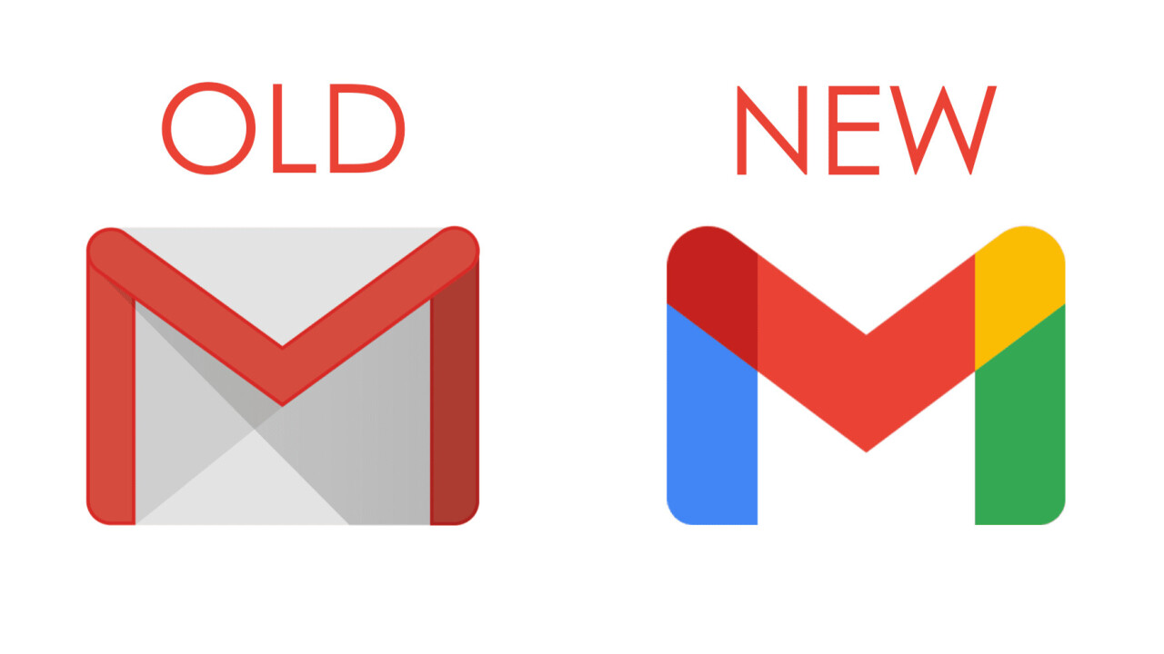
Finally, the time has come for the iconic Gmail envelope to go away as Google has just revealed the new design of the logo that is making the free mailing service platform look very much in line with the company’s other range of products.
The new Gmail logo is the only M that is being made up of some predominant red, small touch of yellow, blue, and green colors that comprises the identity of search engine, Google. Moreover, according to the report by Fast Company, it seems like people are not happy with the envelope being replaced.
The design now comes up with the Google’s four signature colors, with the blue and green colors used to accent the vertical stems on either side or a splash of yellow dotted in the top right-hand corner.
Some other tools, which include the Sheets, Drive, Docs, Meet, Calendar, and Slides, have also seen their logos overhauled as a part of a wider rebrand of the company G Suite offering under the name of the Google Workspace.
These, too, will also be reduced to streamline some of the outlines rendered in all four of the company’s primary colors, which brings them much closer to Google’s other minimal, four colors logos, from the pared-back location pin of the Google Maps to the pinwheel of the Google Photos.
As per the report from the Javier Soltero, VP and GM of the Google Workspace, the unified identity of these tools is emblematic of the increased synergy between the apps themselves.
Under the Google Workspace umbrella, the company is now even attempting to create an even more seamless experience of using these tools together, with the new functionality which allows the users to work across the multiple different apps without needing to change the tabs.
This even includes the ability to preview the content of a Google document within an email and the integration of the Meets window into the Docs, Slides, and Sheets, so that users can present a document at the time of a video call while still being able to see those who are on the other end of the line.
Here are some of the opinions from the users
Leena Baidya, a social media executive, says, “Everything to me looks the same because Google probably did not think before painting all icons with the same four brushes. How much colour is too much colour?”
Some users who find it difficult when logos of more than one Gmail product are placed on their toolbar. “I have Google Drive, Meet and Gmail simultaneously open on my toolbar at times, and it gets so difficult to differentiate one from the other,” Simran Utwal, a dentist, says.
Speaking about the envelope logo, Gmail user Anant Negi says, “I really liked the original logo, especially because it looked professional when we use it with Google suite for our workspace. While I do understand that the new logo brings in the connection of various colours together, which in a way shows togetherness, I feel that they should have put in an option to transition between the two icons. Just like Instagram’s previous icon was perfect, I feel this too was taken quite suddenly. I am going to miss the old logo, and I do hope that they provide a theme option perhaps from which we can keep using the original ‘red and white envelope’ icon by default.”


