


Re-branding is no more something we hear about once in a while these days. In the startup world, re-branding is a term that is getting more and more regularly heard. When Airbnb re-branded and changed their logo there was a huge reaction to that on twitter.When Zomato re-branded twice (remember the heart and the spoon) From the Heart to the Spoon – Zomato’s 2nd logo in 3 months ! that drove a lot of reactions on social media as well.
This time it is Housing.com who is re-branding. And like it always is with them, this exercise has been a grand one as well.
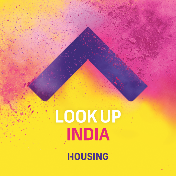
Housing.com unveiled its new brand on the 4th of March. The brand and the mission statement is called the ‘lookup’ and is designed by Moving Brands. Housing.com’s new vibrant color palette in the new logo and wordmark is based on four key brand colors namely Pink, Yellow, Purple and Green. The new brand colors play a key role in the new identity, personifying Housing as optimistic, game-changing and uncompromising along with making life look brighter and embody the spirit of optimism!
The rebranding campaign itself has been massively advertised with Housing.com’s blog post, videos of the rebranding exercise appearing. After it was unveiled, #lookup was trending 6th in India on Twitter.
Massive ad spending by http://t.co/5RFNsc6G6a across channels…is it worth it ? #lookup #startup
— Muthu Ranganathan (@muthurangnathan) March 5, 2015
1.6M views on our @Housing journey film! We’re buying MB Director Jimmy a trophy https://t.co/DzrY8rNG0U — Moving Brands® (@movingbrands) March 5, 2015
There also was a lot of curiosity created around this rebranding with a number of pre-launch pictures coming out.
pic.twitter.com/fLt5O5aSfQ — Housing.com (@Housing) March 3, 2015
pic.twitter.com/yKpq60CRcJ — Housing.com (@Housing) March 3, 2015
Look Up quickly became an expression of our relentlessly optimistic spirit. It’s the same spirit we wish to share with our users, many of whom are making big, life-changing decisions. But when we urge you to ‘Look Up’, it’s more than an invitation to search housing.com – it’s an encapsulation of our optimistic, can-do attitude. It is an attitude we want to share so that everyone everywhere might live better and make the best of their abilities to push humanity further. Look Up is the spirit that drives us to out see, out think & out do to make everything 10x better for everyone.
Rahul Yadav, CEO of Housing.com said about rebranding on the site’s blog. Housing plans to map 24 lakh houses in all metro cities and bring properties to 10,000 towns and villages.The company promises that this is not all. Everything will be 10x more. It is also being said that Housing.com is planning to expand globally and this latest rebranding has been done to position Housing.com as a global brand.
There were a number of reactions to this Housing’s rebranding campaign. Most of the reactions were positive and praised Housing.com for its latest rebranding effort. The harshest reaction though came from Vidit Bhargava, Creator of the iPhone app LookUp. In his blog he has strongly criticized Housing.com for stealing their brand identity. Vidit said on his blog
Blatantly copying our brand and logo isn’t right. I’m not sure how your conscience allows you to do this. Some may say, Imitation is the best form of flattery. But Personally, I’m not flattered. We spent a lot of time in making our logo, deciding the name. I’m not flattered by you blatantly stealing our identity. To quote Sir Jonathan Ive, “Imitation isn’t flattery. It’s stealing.”

Other than this one, the reactions to the rebranding campaign have been positive.
#lookup @Housing Great positivity & outlook ..The entire profile attracts me to click #lookup
— Nimisha (@nimishav9) March 5, 2015
#lookup Nice aggressive campaign
— Onkar Bhosle (@onkarvbhosle) March 5, 2015


