


Logos are indeed a very communicative tool in today’s advertising world. It is recognized by masses and relatable by all. But, somehow due to several reasons mistakes happen in logo design and the repercussions are unimaginable. It might be overlooked by the designers or the firm but to a layman’s view it might not create ‘that impression.’ So here is the list of some common mistakes in logo design which should be known and avoided at all costs.
- Use of Effects or Over-Effects
The drop shadow, outlines, bevel effect, emboss, etc. are some of the effects which are a BIG NO NO in today’s trend. It was a sigh of relief when logo dropped the drop shadow and went in for minimalism. These effects look immature and suggest forced efforts made to add unnecessary elements to the design. Be aware that even if your software provides this, that doesn’t mean you should use it compulsorily.


2. Plagiarism
With the advent of Internet and media in our daily lives, viewers are more susceptible to knowledge and acts of theft. Therefore, it is very important that you do thorough research before finalizing the design. If you have any idea in mind regarding shapes, concepts or colour palette, use the internet tools wisely and search. Even if a deserted bakery house’s logo matches yours, then you’re doomed for cheating and copying.


3. Too many typefaces
Too much or too less of anything is harmful. But here, the case is a little different. It would be okay or instead, good if too less is applied here but TOO MUCH IS A NO! Too many typefaces in a single logotype is a distraction and highly amateur. It says about how much indecisiveness is involved in finalizing one. 1 or 2 logotypes are enough and creates more strong image rather than multiple and also, they can be easily recognized.


4. Too many explanations
Whenever you are explaining your design to your client, remember to always have one or the theories only. That’s it. Too many explanations and brainstorms for the same design shows indecisiveness and confusion. Stick to one or utmost two theories and symbolism. Again, too much never helps here.
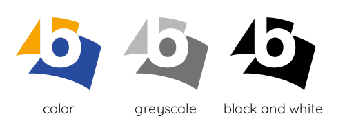
5. Colour Selection
Do not always hurry to add colours. They are an essential element in the design and should be analysed well before selection. You just cannot arbitrarily select the colours. A certain thought process and reasons should be behind it and also you should check the logo in gray scale and black and white. Some logos might work wonders in colours but fail in black and white. A good logo is something which stands by it design in all colour forms.
![]()
![]()
6. Complexities
Simplicity is definitely the key. Too many pictographs or rebus in a logotype is heavily unattractive and amateur. Try to keep it simple and READABLE. Do not always try hard to depict the literal meanings. A simple hint or symbolism would be enough. Avoid too many design elements, shapes, colours and special effects.


7. Stock Images
According to Smashing Magazine, ‘downloading stock vector imagery from websites such as VectorStock is not a crime, but it could possibly get you in trouble if you incorporate it in a logo.’ It usually happens wen the logo design job is done by an amateur or within too tight time limits. Try keeping your design as original as possible. Stock images are very common and familiar and you can have similar logos in the same design format.
![]()

8. Over-Confidence
Never get emotionally attached to your design. Over confidence is always destructive. Show your designs to others and get a view, be it from professionals or a layman’s. When you are working on a design, you get attached to it and after some time it becomes difficult to identify any mistake or flaws. So without explaining any background, get a view from someone else.
9. Raster Images
A logo should be designed in a vector graphics program such as Adobe Illustrator to ensure that the final logo can be scaled to any size, enabling the logo to be applied easily to other media. A raster image (made out of pixels, such as what you would find in Photoshop) can’t be scaled to any size, which means at large sizes, the logo would be unusable. This would lead to heavy pixelation and poor quality of the logo and would not be used any where in the same format and clear space.

10. Too Literal or Too Abstract
Being too literal in logo design i.e. making every word or alphabet mean the exact term in pictographs can make the logo unreadable. Being abstract, too, at the same time can leave you clueless about what the brand is and what is it trying to convey. One should be able to understand the difference between the two and design accordingly.


