

27 May 2017, India:
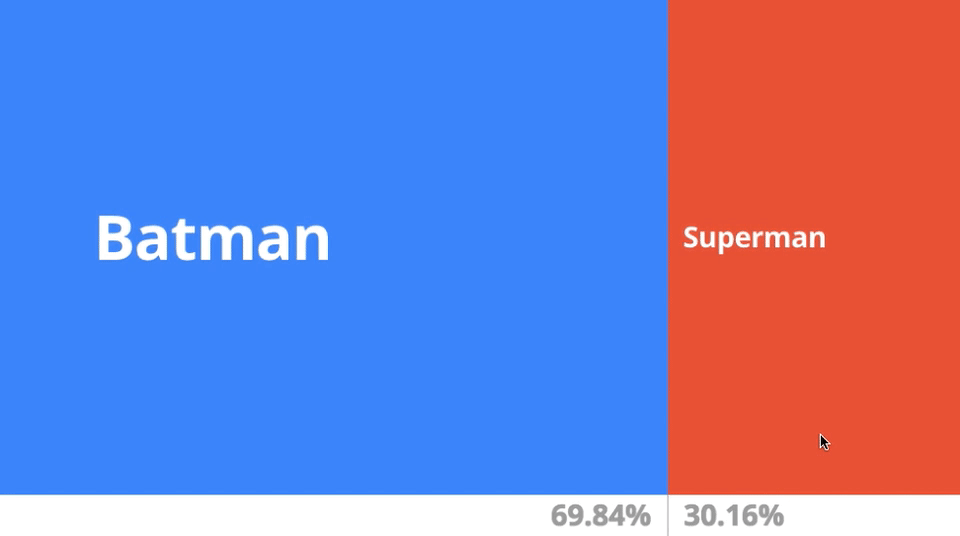
Google is making life fun by launching Data GIF Maker. So if you want your presentation to look attractive and lively, you can surely opt for Google Data Gif Maker. It basically shows your data comparison in Gif format unlike usual graphs.
“Data visualizations are an essential storytelling tool in journalism, and though they are often intricate, they don’t have to be complex,” said Google. “In fact, with the growth of mobile devices as a primary method of consuming news, data visualizations can be simple images formatted for the device they appear on.
“We typically use the tool to represent competing search interest, but it can show whatever you want it to – polling numbers, sales figures, movie ratings etc.”
To get started, you pick your two topics, enter your data in a comma-separated list, write a few words about what your readers are looking at and then let the tool do its work in creating a GIF for you (which can actually take a while). And that’s it.
Also read- Apple News Appoints New York Magazine’s Lauren Kern as Editor-in-Chief


