


Image Credits: sivitech.com
So much has been said and done when it comes to logo designs. Best logos, perfect logos, creative logos and so on and so forth. But here, I would be mentioning those logos which have indeed stayed ‘true’ to their brands and thier values. They may not be famous or widely talked about but one thing is for sure, when you see them you know them and you instantly know what the brand sells and preaches.
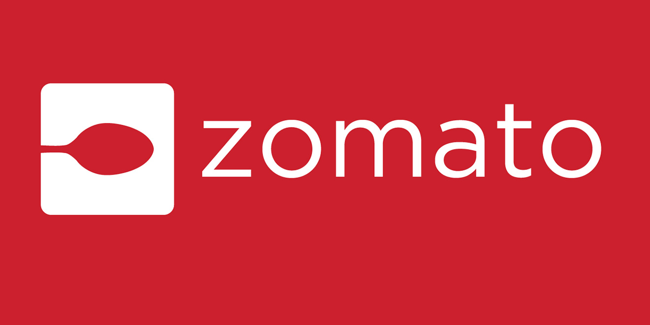
1. Zomato
After Zomato took over Urbanspoon, it added the spoon to the red. This way the Urbanspoon users just have the red to their views. This was done only months after the launch of the heart logo. Despite the fear of uninstalls, they went ahead with the spoon logo only to be familiar with the users of Urbaanspoon. But whatever may be the reason, the heart logo or the spoon logo, both of them have managed to reach out to the users in the most simplest form of pictograph.
According to Deepinder Goyal, the founder of Zomato, ‘simple belief about ‘people and food’ gives wings and purpose… continue to built conversations over great meals.’
The purpose is well-achieved with both the heart with a fork and the spoon in delectable red.
![]()
Old logo
![]()
New Logo
[box type=”shadow” align=”aligncenter” class=”” width=””]Related Read:
The Geometry Of Logo Designs[/box]
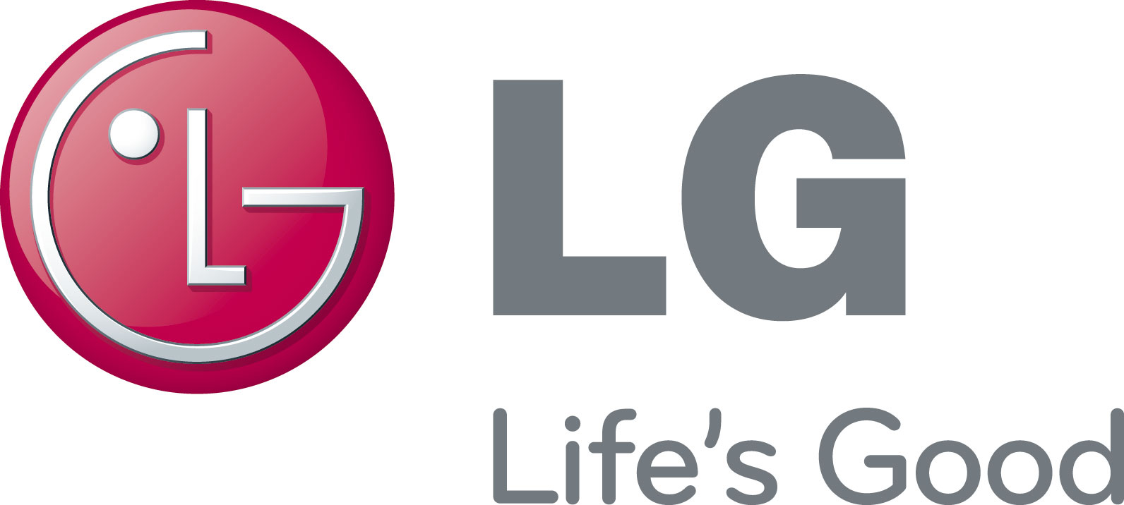
2. LG
The mere placement of the alphabets ‘L’ and ‘G’ made the logo of LG so relate-able, easily identifiable and magnificently simple. The symbol is perfectly coherent with the slogan of ‘Life’s Good.’ The face formed from the alphabets is a smiling with the dot depicting the focused, goal oriented eye. The logo has been consistent except for some slight changes but it still stands strong to its brand value and image. The happy face says it out loud that the consumers would be in for a joyous, ‘good’ life.
![]()
3. Apple
It would be an offence to talk about logos holistically depicting brands and not mention the Apple logo. The Apple logo is one of its kind which seems to fulfill all the criteria of a good logo design. It is minimalist, sleek, recognizable, powerful and exudes all the qualities like the brand does in its products and services. It resonates the class and the chic sophistication which the brand provides.
![]()
[box type=”shadow” align=”aligncenter” class=”” width=””]Related Read:
7 Most Popular Logos And Their Hidden Meanings ![/box]
4. Coco Chanel
A lot has been said and written about Chanel’s logo history. Several assumptions have made on its history and as to why Coco chose the interlocking Cs’. Some say it came from the interlocking C’s found on the stained glass windows of the Château Crémat in Nice. The same pattern was also seen on the stained glass windows of the Chapel of Aubazine, where Chanel spent her childhood or maybe as plain initials of her name. It also held reference to her dedication to the love of her life, Boy Capel.
Whatever maybe the reason, the logo still stands strong since 1925 and is widely recognized. The use of bold strokes in the C on a black background calls out for elegance, sophistication, class and uniqueness in its own way.

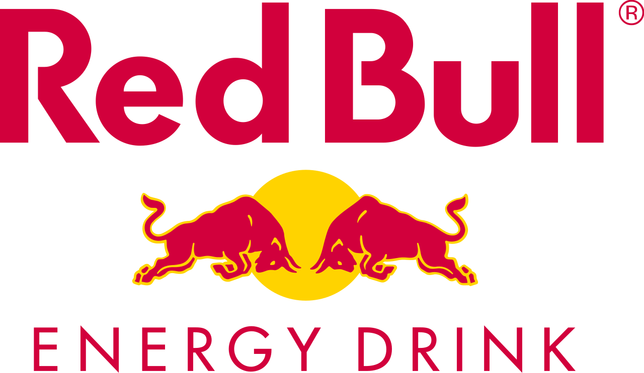
5. Red Bull
The red bulls charging each other gives a clear image of power, fight and the immense energy which is hidden within them. It shows speed, risk-taking and aggressiveness. The yellow circle behind depicts the sun indicating that this drink is apt for the extra dehydrated weather. It is an energy drink whihc ‘gives you wings’. The logo is a rebus and has been standing strong as the brand identity.
[box type=”shadow” align=”aligncenter” class=”” width=””]Also Read:


