

![]()
In the process of brand imaging, logo has always played a vital role. It is that symbol which is easily recognized even by a 4-year old. Human brain memories pictorial representation faster than text and this is the reason, why we were asked to write, picturize and learn. Logo designers have aptly used this concept to make the impactful designs which have held human eyes for years. Logo should be simple but also with a hidden element in it. It gives us the idea of smart design. So, here’s the list of few best logos ever made:
1. Apple
Instructed by Steve Jobs to replace the complex design, Rob Janoff created the 1977 logo featuring a rainbow-striped apple illustration and the word “apple.” It was supposed to appeal to young people and highlight the computer’s unique ability to reproduce colors and also to ‘humanize’ the company. The 1977 logo also featured the now iconic “bite” taken out of the apple, which was supposed to distinguish the illustration from a cherry. Janoff also said that there was no rhyme or reason behind the placement of the colors themselves, noting that he wanted to have green at the top “because that’s where the leaf was.”
After 22 years of its use, in 1984, coinciding with the release of the Apple Macintosh, the company decided to simplify the logo to the lone apple, thinking it iconic enough without the accompanying word. It was replaced with a more modern monochromatic look and since 33 years, the overall shape of the logo remains unchanged.
Keeping the philosophy of simplicity alive, Apple logo stands for chic, sophistication with high quality products. The logo design strictly followed the basics of the golden ratio and made an impactful design.

![]()
2. IBM
The first logo was made in 1888 with the stylized name ‘International Time Recording Company’. In 1924, the company was renamed as International Business Machines when it became an international manufacturing company. The logo that was used from 1924 to 1946 was in a form intended to suggest a globe, girdled by the word “International”. The intricate, entwined design of CTR was replaced by bold lettering of “International Business Machines,” configured to mimic a globe, emphasizing the “International” in IBM.
The logo that was used from 1947 to 1956 was replaced with the simple letters “IBM” in a typeface called “Beton Bold.” The logo that was used from 1956 to 1972 took on a more solid, grounded and balanced appearance. In 1972, the horizontal stripes now replaced the solid letters to suggest “speed and dynamism.” This logo (in two versions, 8-bar and 13-bar), as well as the previous one, was designed by graphic designer Paul Rand.
![]()
IBM Rebus Source
3. Pepsi Co
In 1898, Bradham used a scribbled logo script as the first Pepsi logo to brand the product. When his business got established and people started enjoying his drink, Bradham decided to modify the Pepsi logo into a more customized version of the previous logo script. Thus, in 1905, a modified script logo was introduced, followed by a second change in Pepsi logo in 1906 with the inclusion of the slogan, “The Original Pure Food Drink”, in it.
By 1943, the Pepsi logo adopted a “bottle cap” look that included the slogan, “Bigger Drink, Better Taste”. Later, in 1962, the Pepsi logo was replaced with two bulls-eye marks encircling “Pepsi”, and then again in 1973, into a boxed Pepsi logo with minor typeface changes.
In 1991, Pepsi commemorated the evolution of its scripted Pepsi logo by featuring a logo design with an italic capital typeface. Later at the company’s 100 years celebration in 1998, Pepsi-Cola unveiled a new logo that symbolized the brand’s innovation and global recognition. The logo was modernized 5 times from 1971 to 2005, each time becoming more sleek and defined.
![]()
4. Shell
The logo for Shell has always, in fact, been a shell, becoming less realistic with each redesign. Both the word “Shell” and the Pecten symbol may have been suggested to Marcus Samuel and Company (original founders) by another interested party. A certain Mr. Graham (of apparent Scottish origins) imported Samuel’s kerosene into India and sold it as “Graham’s Oil”. He became a director of The “Shell” Transport and Trading Company, and there is some evidence that the Shell emblem was taken from his family coat of arms.
In 1900, the design was simply a black and white image of a shell. It was around 1915 when the rendering allowed for easier reproduction and color first appeared with the construction of Shell’s first service stations in California. Not only did Red and yellow help Shell stand out, but they’re also the colors of Spain, where many early Californian settlers were born. Perhaps by displaying Spanish colors it was hoped an emotional bond would be created.
[box type=”shadow” align=”aligncenter” class=”” width=””]Related Read:
History Of Googles Logo Changes And Thought Process Behind Their Creation ![/box]
From the 1950s onwards, the icon became more and more simplified, improving recognition and memorability. The 1971 logo, which is still used today, was designed by the French-born Raymond Loewy which omits the company name.
![]()
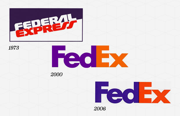
5. FED Ex
In 1971, the FedEx logo was the full name of the company, “Federal Express,” in blue and red at a slant, meant to be intentionally patriotic and associate the company with the U.S. government. The initial logo helped FedEx become successful, and in 1994, the current logo was created. If you look closely at the space between the E and the X, you will notice a small arrow hidden in between, meant to symbolize FedEx’s speed and accuracy. It’s subtle, but now it’s all that one can see whenever the logo appears. Hidden symbolism used in the logos is like cherry on the cake. It astonishes the viewer and brings out the unexpected ‘wow’ factor.
6. Amazon
Anyone who wants to create a branding empire of their own should pay attention to what Amazon has accomplished with their simple but effective logo. When it first started it was an online book store and wanted to represent the dense market that it was venturing into and hence the Amazon river represented in the logo (let’s assume it that way). As years passed, Amazon ventured into other products as well until to the present where they started selling almost everything online. Notice the arrow from ‘A’ to ‘Z’ in the Amazon logo? The thought is that Amazon carries everything from everywhere. It also indicates the smiles which it brings to people on timely delivery.
7. Spartan Golf Club
Unusual but catchy! This logo is not iconic and well-known but is definitely one of the best logo. It includes both the centurion helmet of the Spartan and the golfer making his swing. It is one of best example of optical illusions, one of the techniques to surprise the viewer. It fulfills the requirements of both the terms and effectively uses figure and ground principle. It is the logo with hidden meaning leaving the viewer with multiple interpretations.

[box type=”shadow” align=”aligncenter” class=”” width=””]Also Read:


