

Uber’s logo re-branding was one of the most talked about topic this year since February. It now belongs to the category of one of the most controversial logo changes ever made. It has received e`nough flak, criticism, queries, doubts, etc. from even a layman, ignoring the logo experts and graphic designers.
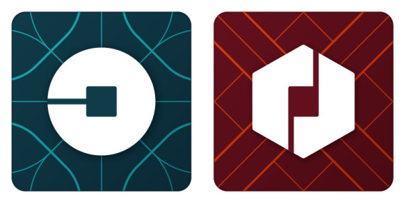
The black-and-white Uber icon is now replaced by a colorful geometric shape—hexagonal if they drive, circular if they’re a rider—surrounding a small, bit-like square. The colors and patterns will vary from country to country—red in China, turquoise in India, dark teal in the United States—but everywhere, the app will open with an elegant, patterned animation, welcoming users to the new Uber. In a complete departure from its original icon featuring a stylized “U,” the new icon is a non-distinct image of a square embedded in a circle (in rider apps) or a hexagon (in partner apps).
(Source)
According to Uber, the square represents the bit (as in the basic unit of information in computing) — a concept central to Uber’s business philosophy. Uber argues that its new look would “…provide consistency, highlight information and make our brand easy to recognize. The unique aspect of Uber is that we exist in the physical world. When you push a button on your phone, a car moves across the city and appears where you are. We exist in the place where bits and atoms come together. That is Uber. We are not just technology but technology that moves cities and their citizens.”
While Uber’s new logotype and website design might be aligned with this goal, its new app logo is not; the new logo is far less recognizable as representing the Uber brand than the one it replaced. The primary function of a logo design is to identify the brand, differentiate it from the competition, and create meaningful associations in the minds of its customers. The new Uber icon falls short on all these criteria. Unlike the original logo, the new logo is not instantly identifiable with Uber; it could as well be a logo of a computer, communication, chemical, or biotech company. Furthermore, its overall design—a square inside of a circle/hexagon — is not distinct, resembling many other logos and app icons (including the JPMorgan Chase) . Also, the concept of “bits and atoms” can describe a wide range of companies, including Intel, Amazon, and Google; it does not uniquely identify Uber.
The problem with the bit and the atoms is that, at least judging from the main Uber website, there is no real synergy between them and no relationship to the logo or the rest of the layout and typography. It’s all nicely placed on there but it feels like patchwork.
(Source)
Most importantly, there was no immediate market-driven reasons for Uber to change its logo at the present time. The idea did not come from customers, drivers, brand architects, or others in the marketplace. It came from inside the heads of CEO, Travis Kalanick, and his design team. Uber’s billionaire boss clearly took this exercise in kindergarten-level picture drawing very seriously. According to Wired magazine, Uber’s CEO has spent the last three years working alongside Uber’s design director Shalin Amin and a dozen or so others, “hammering out ideas from a stuffy space they call the War Room”. The story of how Kalanick and his design team came to replace the ubiquitous “U” logo is about more than a corporate rebranding effort. It’s a coming-of-age tale.
Along the way, he studied up on concepts ranging from kerning to color palettes. “I didn’t know any of this stuff,” says Kalanick. “I just knew it was important, and so I wanted it to be good.” This level of involvement makes more sense when one understands the rebranding was personal. “There’s an evolution here, for the founder as well as for the company,” he says, “because really, they’re very connected.”
Choosing colors was much tougher. The existing palette of black, white, and blue was steely, and resisted being incorporated into promotional materials for, say, Halloween or Valentine’s day. Kalanick became engrossed, evaluating pixels and colors according to what he euphemistically calls his “unique” set of preferences. The designers mocked up mood boards for individual cities, regions and countries, piecing together images representing architecture, textiles, fashion, and art, among other things.

Mood board for India (Source)
During one of a regular meeting while ordering food, a young designer named Bryant Jow drew five boxes and popped a geometric shape around each. It just sort of worked. “We’d made this assumption that one app could represent Uber,” said Jow, 27. The design incorporated Uber’s bits, a nod to high tech, and different shapes, each of which could represent a different product, and beneath them, patterns and colors that could change in local markets. Jow presented the idea to Kalanick, who loved it. By Christmas, the team had nearly finalized the icons for the rider and partner apps.
![]() (Source)
(Source)
This is how Uber who got it’s new logo. However, to build and sustain a strong brand, Uber must ensure that all of its strategic and tactical decisions are aligned in a way that creates value for its customers, collaborators, and the company. In this context, Uber’s new logo is a strategic misstep that in the long run could weaken its brand.
 Uber’s new rider icon (left) and partner icon (right) Source
References: www.wired.com
