


If you look ten years back, the use of animation and motion in user interfaces was considered a crime rather than a best practice. It was associated with flashy websites, jumping popups and blinking buttons. But this has changed tremendously over the last few year. Since the introduction of the iPhone and mobile apps, many designers gained some experience with the possibilities of dynamic animation. Animation is fast becoming an essential part of interface design. It gives designers a whole new dimension to play with — time.
Modern interface isn’t a series of static screens anymore. Using animation help bridge the gap between software and human nature by adding the dimension of time to the product.
The most intuitive and delightful experiences are always the ones that put detail into motion design. In my previous article 3 Key Uses for Animation in Mobile UI Design, I’ve talked about essential uses cases for animation. In this article I’ll provide a few examples that illustrate where you can add beauty to you app to make the user experience more alive and delightful:
Make the loading experience visually enjoyable
When apps create visually stimulating opening animations it brings an level of excitement to the user, every time they open it. But some animations go beyond that — animation in example below isn’t purely delightful, it also influences a user’s eyes and control where users should focus.

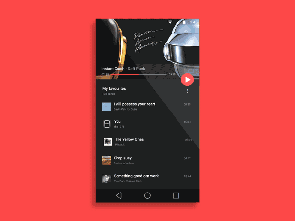
Onboard users with visually engaging content
When user interact with your app for the first time, they have to learn and understand what you made. There’s always a period of onboarding and this period demands a flawless UX. Smooth transitions and good animations in the onboarding flow has a tremendous impact on how first-time users will engage with the app.
User onboarding experience in example below is full of creativity and personality. It really shines in visual design and microcopy, and giving new users a taste of the app’s experience.

Incorporate interactive tips
Animation is able to create interactive short stories for each of the features within your app. This provides users a clear understanding what to do next.

Provide visual orientation
The most fitting places to add animation in design are at moments of change. When state change happens, users need to understand how the new sceen is related to the previous one.
Static design doesn’t provide context between states.
Establishing connections and content relationships is when animation is particularly helpful, both functionally and stylistically. Animated transitions can work as intermediaries between different UI states and can help orientate users.

Explain relationships between elements
A well-designed animated transition directs the user’s eye to exactly where it needs to be as they interact with the experience. Animation puts emphasis on the right elements depending on what the objective is.
Spatial Awareness
Animation really help users build mental maps of spatial interfaces. It explains where things come from and where they go.

Provide clear feedback
Animation can be used to reinforce the actions the user is performing. Animated feedback helps demonstrate the result of a user’s interaction, whether or not it was successful, and why.
Indicate problem
When you think of designing for error states, it’s important to work on making them obvious to users. Password shake is a great example of clear feedback: simple head shake, directly relates to how people give feedback to each other.

Reassure user
Animation can be used to help people visualize the results of their actions. By following the principle “show, don’t tell”, you can use animated feedback to show what’s been accomplished.
In Stripe’s example below, when the user clicks “Pay”, a spinner briefly appears before the app shows the success state. Checkmark animation makes user feel like they easily did the payment and users do appreciate such important details.

A note about logic
One key component to all animation is logic. You need to make sure you give logic to your environment. It’s especially important to think this through on smaller screens where you’re forced to think about how to properly use the little screen real estate you have and how you can reduce complexity.
Always make your animation logical and purposeful: unpredictable interactions together with too much animation can kill the UX of a product. Some animation, such as the one mentioned below, while technically well executed, makes interfaces more confusing instead of less. It’s hard to predict that swiping over the photo would result in transition to the separate view which contains details about the person.

Conclusion
Animation may be used in a wide range of scales and contexts to unite beauty and function. But you should animate deliberately and think through each animation before you create it, because
Animation is not about making your app cool. It’s about providing your users with the experience they expect.
(Feature image- mobilemarketingwatch.com)
Related Read: Birth of Technology – Back in 18th century
(Disclaimer: This post was originally published in babich.biz by Nick Babich and has been reproduced with permission. Techstory is not responsible or liable for any content in this article.)


