The responsive design lets users view websites compatible with different screen orientations. Text, UI elements, and images are the website components that synchronize. Developers create a single set of code in website scripts that allows a website to look aligned. To make a website responsive is a crucial task that requires significant amounts of effort to engage an interactive design.
Why Is Responsive Testing So Important?
To engage a consistent look across devices with different screen sizes, website developers and designers utilize several ways to perform responsive testing. Website professionals can check the responsiveness of the webpages considering the differences and specifications on different browsers, platforms, and devices. Responsive testing impacts website development, quality, and optimization simultaneously.
Professionals performing these tests may find significant differences like font incompatibility or other screen resolution issues. This approach helps developers devoid of any such issues before the website goes live.
Below are a few points to help you understand the process and significance of responsive testing:
- Analyze the overall mobile view of the uploaded content
- Rectify any issues related to the readability of the text in different screen resolutions and mobile viewports
- To indulge in a proper appearance of all images
- View all data tables and graphs compatible
- Check if navigation links or menus are attached effectively
Through responsive testing, users can realize the real-time experience for their users accessing the website on different platforms, browsers, and devices. To check if all the webpages on a website are performing symmetrically well in terms of color resolution, fonts, and graphics, developers considerably perform responsive testing.
Different Ways to Perform Responsive Testing
For website developers and designers, responsiveness is a significant factor to consider while monitoring possible bugs and errors in the frontend of a website. There are several ways website professionals adopt to perform responsive testing.
Chrome Developer Tools
To indulge in responsiveness on websites, Google Chrome comprises device mode in its developer tools where users can test and perform responsive design checks. Generally, a responsive testing tool provides you a resized viewport. However, Google Chrome’s device mode feature emulates touchscreen interactions and mobile device experience on your web browser. It allows users to see the layout and website components with different screen sizes and mobile device simulators. With this, users can detect errors and view their rectified version in real-time. Through a simulated user experience on Chrome’s device mode, there may still be several significant components that are not simulated or realized.
Real Device Testing
This approach exists where testers consider a few real devices to test the responsiveness of websites. Real device testing was an easier process in the earlier advent of smart devices as there were not so many devices and platforms available in the market. But with time, the number of devices, browsers, and platforms increased and it would not be affordable to buy all the devices testers want to test the websites.
This strategy made a few website developers develop different device versions of their websites. However, developing browser-specific website versions was proven more competitive. This approach engaged in better user experience for websites.
Virtual Device Testing
With technological advancement, responsive testing has become more accurate, affordable, and faster. As mentioned before, it is not possible to purchase a large number of the device and test your website’s responsiveness to each. It may not only be costly but may also consume more time.
To overcome this, companies introduced real device clouds where testers could check the responsiveness of their websites on a large number of devices. Virtual devices on these tools indulge in Simulators and Emulators. The tools emulate the user experience, interface, resolution, and internal environment of devices. Users can check the responsiveness of a website on different devices at a time by adding them to the tool.
You may find several virtual testing device tools, but I found LambdaTest’s LT Browser the best among them. Initially, I chose LambdaTest as per my friend’s suggestion because he had found it relatively affordable to its contenders. However, that is not the only reason for me liking this tool anymore. It seems more robust and rich-featured to me now.
What Makes LT Browser a Hit in Responsive Testing?
LambdaTest LT Browser enables users to view a website on different screen sizes and resolutions more interactively. The tool has more than 25 virtual devices included in it, which makes responsive testing better than ever before.
It has become widely popular in the responsive testing market. There are lots of reasons for this tool acquiring this much success in the market, but the most highlighted ones are:
- Run First Responsive Test
- Smart device search
- Add Multiple Devices at a time
- Add custom device if you cannot find your device
- Capture screenshot & mark bugs
- Share marked bugs
- Video recording of the test sessions
- Store videos and screenshots on cloud and share anytime
- Test web-apps or websites even on localhost or behind a login
- Debug your website and view live changes w/o reloading
- Allows keyboard shortcuts
I here provided you an overview of the features with which you may recognize LT Browser. The tool is significantly useful for website developers, designers, and quality analysts.
How Responsive Testing Is The Easiest With LT Browser?
As discussed before, Users of LT Browser are leveraging lots of functionalities and add-on features. In this section, I will help you understand why and how Responsive Testing has become faster with LT Browser. This factual elaboration of this tool can provide you a better understanding of this process structure.
Let’s have a look at some significant functionalities and processes of this tool:
- To get started, you can download the executable file of LT Browser from here:
- Download LT Browser For Windows
- Download LT Browser For macOS
- Download LT Browser For Linux
After downloading the tool, users can proceed by entering the LambdaTest account credentials if you already have an account. If you are a new user, you can register yourself from here.
- Begin Your First Responsive Test
- Once you have downloaded the browser, go through the initial instructions.
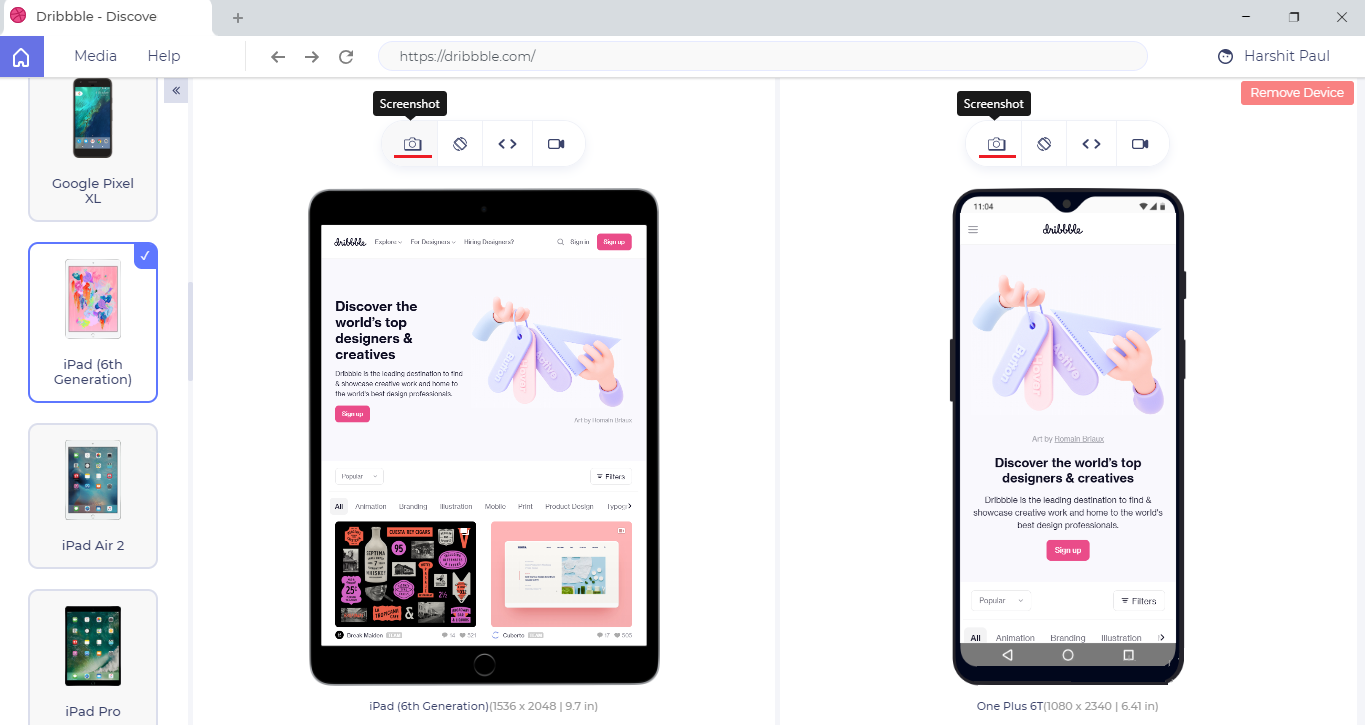
- Thereafter, you will reach the test page where you need to enter the testing URL to the address bar and proceed by pressing ‘Enter’.
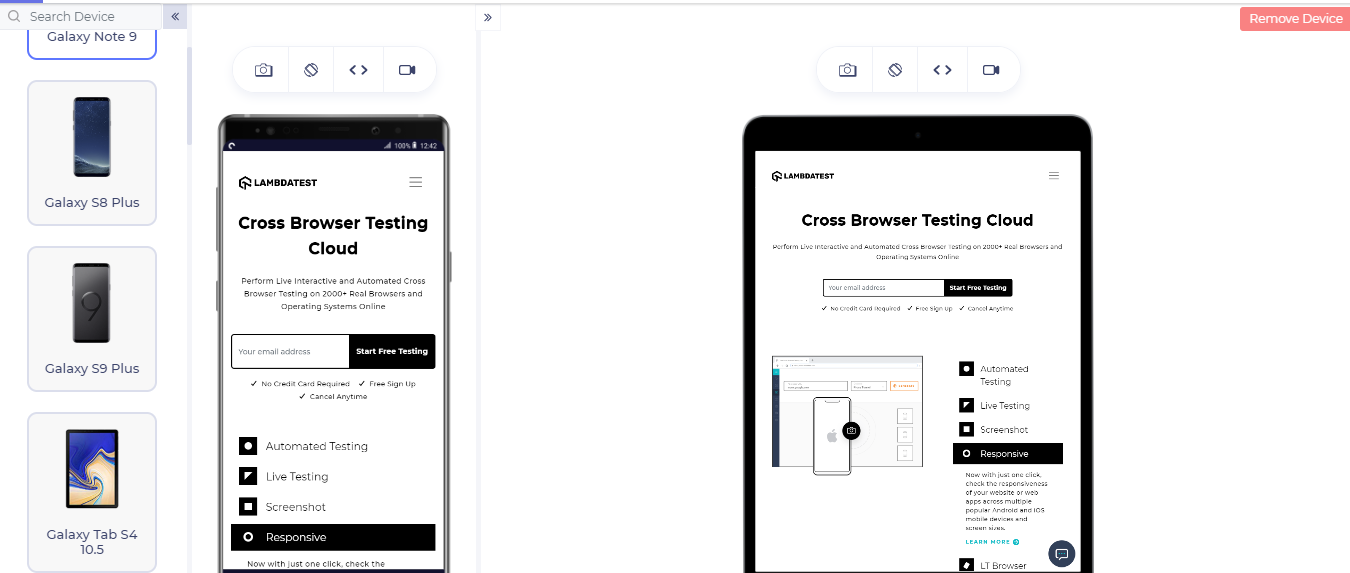
- After pressing ‘Enter’, you may see 27+ devices in the sidebar, two selected devices in the main screen with the website of entered URL.
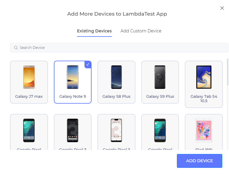
- If you want to remove the device, and want to add another, you can simply add one by removing the existing one.
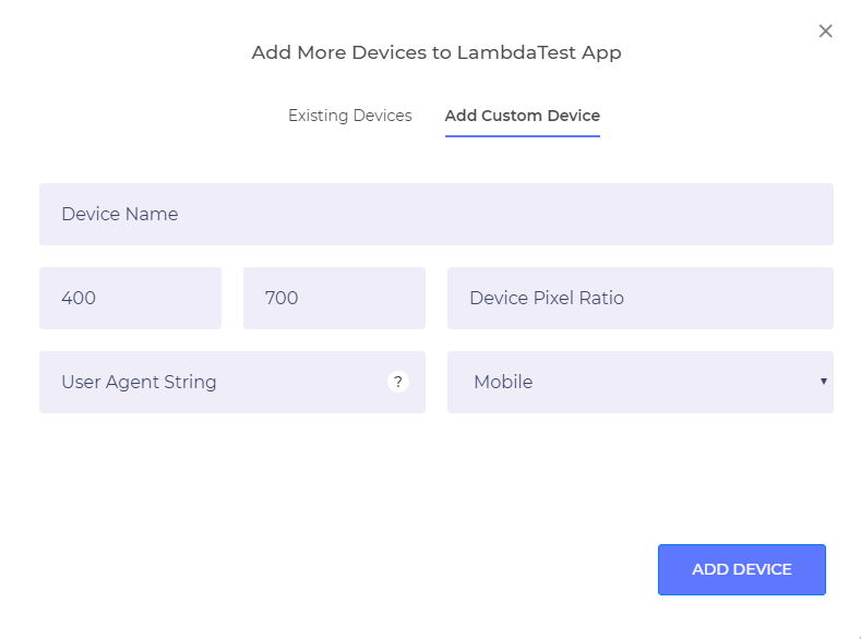
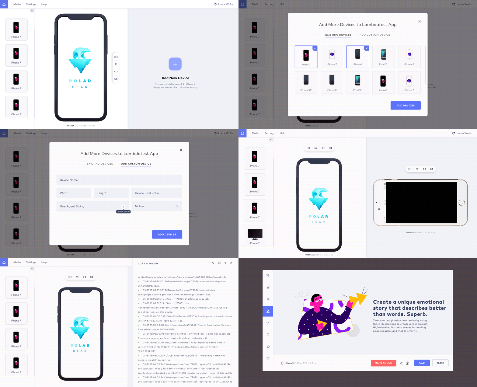
- If you are unable to find your device, you can add a custom device.
2. How to Add A Custom Device
- Although there are 27+ devices with different screen resolutions, if you still cannot find your device, you can easily add a custom device by entering the following details:
-Device Name
-View Port Specifications
-Device Pixel Ratio
-User-Agent String
-Device Platform
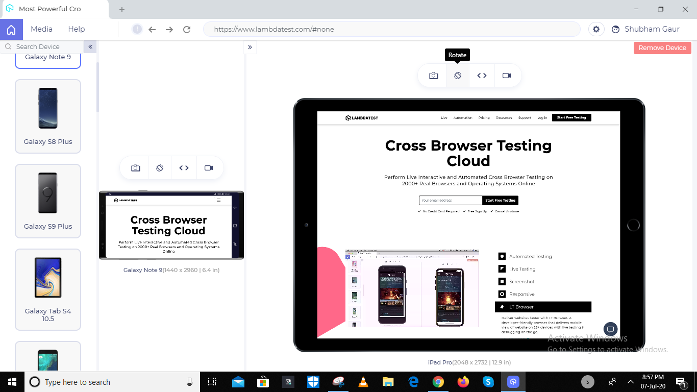
3. Rotating Device From Portrait To Landscape View
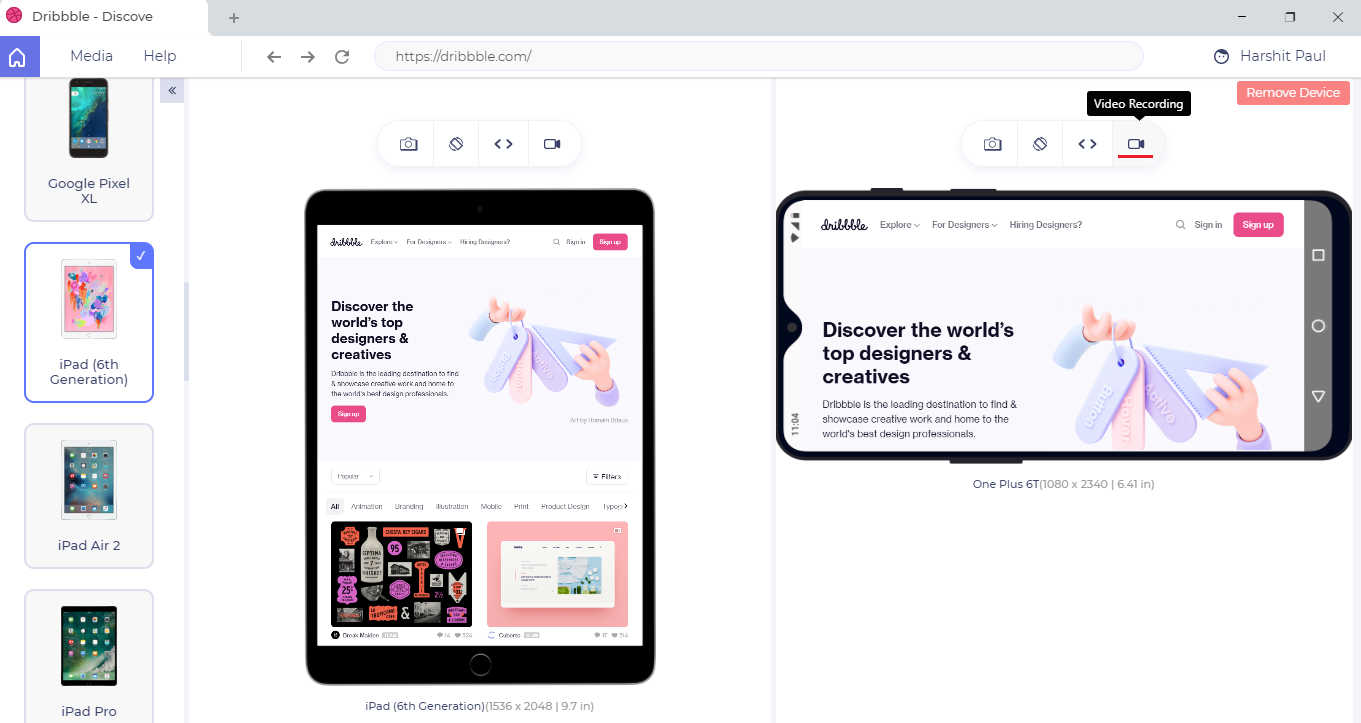
- You can rotate any of the devices by clicking on the rotate button right above both the devices.
4. How to Capture Screenshot & Highlight The Bugs
- To snap a screenshot, you can press the camera icon above either of the devices.
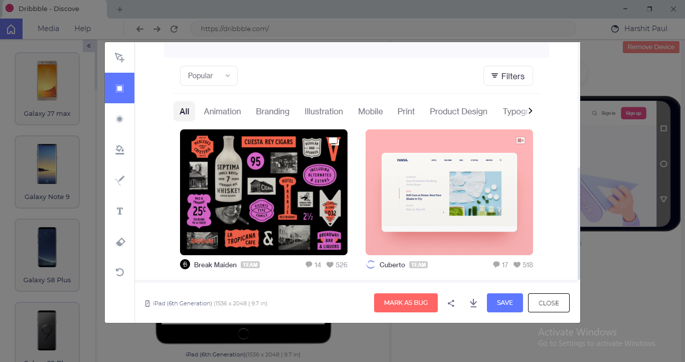
- After you capture your screenshot, an inbuilt image-editor will view the screenshot you have taken so you can review it.
5. Edit Your Screenshot
Like its other user-friendly features, LT Browser has facilitated its users to edit the screenshot they have taken to mark the bugs found on any particular webpage and share it across their connections or concerned team through email, direct messaging, or other integrated platforms on LT Browser.
(There are 38 different apps integrated on LT Browser which you can use to share the bugs.)
6. Use Third-Party Tools to Mark Bugs
- Unlike any of its contenders, LT Browser features third-party tools to mark, track and share bugs more interactively.
7. Record Videos of Test Sessions
Since LT Browser is empowered with cloud, it allows its users to record videos of all the test sessions they perform using this tool and share them through different options. The tool will keep recording the session until you do not press the video record button again. After you press it you will see a popup notifying that your video has been saved.
8. How To Debug a Website Using LT Browser
The most amazing thing that made me stick to this platform for such a long time was that there was nothing significant left that I could not find in this tool. I thought this tool is particularly designed to check the responsiveness of a webpage but later on, I realized that you can also debug your website to detect the bugs and errors in the UI.
- To begin debugging your application, you can press the debug button highlighted.
- After pressing the debug button, users can access the developer tools to debug UI bugs or errors.
Wrapping Up
Although I tried to elaborate on how advantageous LT Browser has been for me in responsive testing if there are still many interactive features that you can find once you use this rich-featured tool yourself. You can experience a shareware version of this tool to experience its usefulness. To use this tool, you can simply create an account on LambdaTest and proceed by entering the same credentials in this tool as well.
One particular feature of this tool was the inclusion of Hot Reloading which made it a big hit in the field of responsive testing. It allows users to see changes in the react code of the website in the LT Browser without reloading it.
Meanwhile, I have also tried other tools in the market, but LT Browser was far smoother than any of its contenders to perform simultaneous responsive testing of devices. And, of course, this was an exploration I did just to keep myself satisfied and go with what is the best in the market.


