

It all began during the Victorian Era when numerous artists and graphic designers came to the frontier of what we call today ‘Graphic Design’. Their attempt to have symmetrical layouts, heavy ornamentation, complexity and decoration was phenomenally impressive for almost half a century during the Victorian history. Since then, there have been several logos which brought about changes in various fields like changing and experiments of the basic concepts, coming out of new layouts, typography methods, fonts, etc.
Pepsi Logo (Gothic)
The logo that we see today started out with this Gothic-esque typeface first used in the year 1898 when Brad’s Drink was renamed as Pepsi-Cola Company.
IBM Logo (Simplicity)

McDonald’s (Popularity)

Jack Daniel’s (Floral)

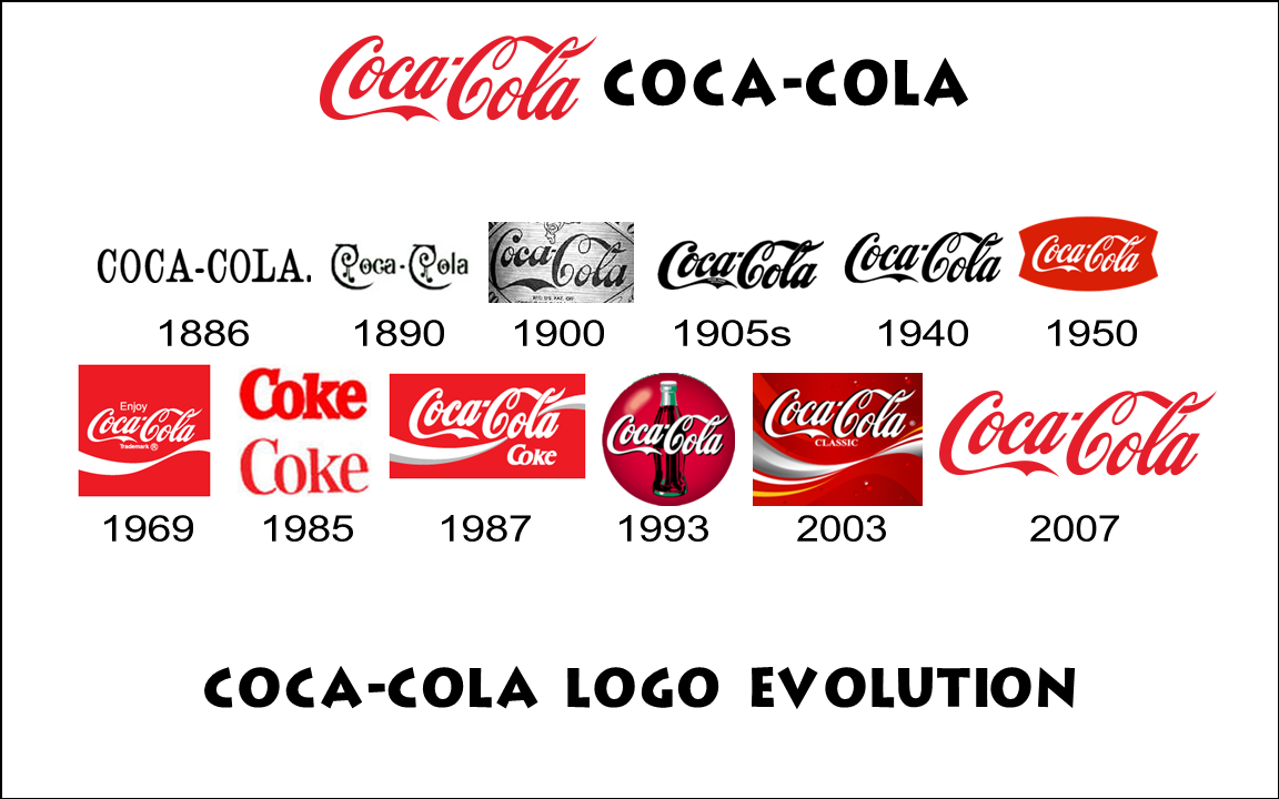
Coca Cola (Art Nouveau)
The red and white color scheme in the Coca-Cola logo is adequately simple, playful and distinctive to attract young audience. While the red color symbolizes passion, determination, youthfulness and vitality, the white color represents the charm and elegance of the Coca-Cola brand. It has been reported that 94% of the world’s population recognize Coke’s red and white.
It has been rumored that Coca Cola invented Santa Claus- wearing a red suit outlined in white trim. This myth has been debunked, as there are multiple images of Santa Claus in red and white predating Coke’s first Santa Claus advertisement in 1931. Coca-Cola can be credited with popularizing Santa Claus in a time before color was regularly used in media. Coke also humanized Santa with certain physical attributes that we still use today (rosy cheeks, large and jolly build, twinkling eyes, etc.). To this day, Coca-Cola is synonymous with winter and Christmas due to advertisements portraying Santa.


Starbucks (Historical Reference)
Starbucks was named after a nautical character, and the original Starbucks logo was deliberately designed to evoke the alluring imagery of the sea. The Mermaid mascot, fondly called ‘the Siren’, used in the old Starbucks logo has been termed as one the most intelligently used element. Much has been written and discussed about Starbucks logo evolution, but the one thing that hasn’t changed in Starbucks logo history since its inception is the ‘the Siren’ symbol. It’s no wonder since ‘the Siren’ symbol has lent Starbucks logo a new meaning and a cult status.
