

![]()
Logos have found an inevitable place in the filed of marketing and branding. It stands for brand recognition and a major, neglected change can lead to the permanent fall of several years of creating that brand name. It is very important to keep certain things on mind before updating logo design entirely or any of its features. Here are certain points which states the importance of keeping present features intact while logo updates.
1. Customers’ Familiarity
Before updating any logo, it is very important to keep the customers as the topmost priority list. A customer, over years, becomes accustomed to a well known brand’s logo. It builds up an emotional bond with them due to familiarity, security, relatability and reliability. Due to these factors, it is important to keep the look and feel of the existing logo intact. At the end of the day, each company, industry, brand is working for their customers and hence, giving a certain unidentifiable shock would not be such a good idea!
![]()
A lot has already been said and discussed about Uber’s new logo. But it had to be mentioned in this article to prove the above point. If a person is shown Uber’s new logo, he would never ever be able to recognize it as Uber. And the reason is simple- there is no traces left of familiarity.
[box type=”shadow” align=”aligncenter” class=”” width=””]Related Read:
What Went Into Making Of Uber’s New Logo[/box]
2. Brand’s Vision
Brand’s vision, mission, market segment and positioning should not be changed due to a mere change in logo design. Yes, the term ‘mere’ is used intentionally because even a slightest change done without enough thought processing could hamper the brand’s market position. The logo update should be in such a way that it doesn’t change the meaning of the previous logo entirely because each logo and its components stand for company’s value. A small change could be responsible for projecting a different aim and vision to the consumers.
![]()
This first logo is for Office of Government Commerce. If rotated at 90 degree angle, it gave an entirely different and obscene meaning. Therefore, before updating any logo, make sure that the brand name is not going at stake.
[box type=”shadow” align=”aligncenter” class=”” width=””]Related Read:
7 Most Popular Logos And Their Hidden Meanings ![/box]
3. Colours
The colours are the basic ‘communicative’ components of the logo design. They eulogize the brand by talking in symbolism and emotional meanings. Colours selected in the first place is due to a certain reason which should not be overlooked. It is the element which attracts human eye the most and stays longer. If the brand’s usual colour palette is tampered, then the unique identity and connection with the existing customers would be lost.

There is reason and logic behind the colours used for all of them and therefore, colour is one of the most important feature that needs to be kept intact.
[box type=”shadow” align=”aligncenter” class=”” width=””]Related Read:
Do You Know These 5 Logos That Explain The Brands Holistically ?[/box]
4. Fonts
Just like the colours, font selection should be kept equally important. To a layman, a font would not matter much becasue he is familiar with it and sees no issues. However, if the existing font is changed, then you would feel awkward. It is simple! The font, too, do the talking!
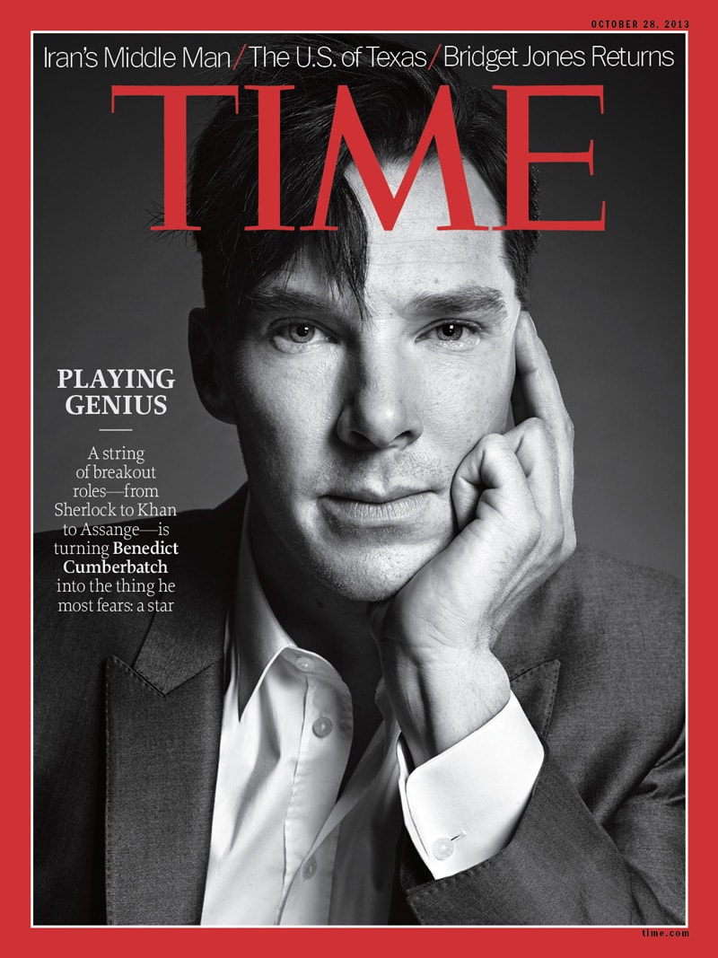

Use all your imagination and replace the TIME with the Disney. And let us know whether you liked the replacement!
Font matters, too. Think before you change it or before you choose it.
[box type=”shadow” align=”aligncenter” class=”” width=””]Related Read:


